Negative Diffusion in Planetary Rings
Collisional simulations of planetary rings that have been perturbed by a nearby moon have a tendency for material to clump together, moving into regions of higher density. This page contains a number of images and animations exploring this behavior.
All movies on this page made with mencoder using the XviD codec. They should play well with DivX, but if you have any problems you can download MPlayer for your platform. If the movies play, but not well you might still consider getting MPlayer in which they should look better.
What is Negative Diffusion?
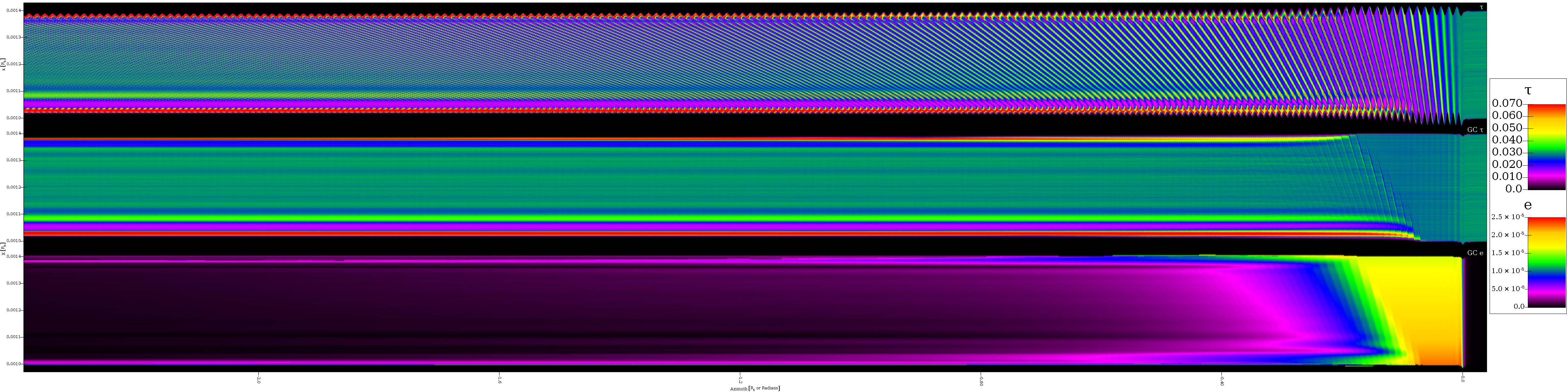
The best way to describe negative diffusion is probably with images from one special simulation that we have performed. Most of our simulations use a local cell method with boundary conditiions that are designed to preserve the gradient in epicyclic phase induced by the passage of the moon. This gradient is the result of the fact that the leading edge of the cell passes the moon before the trailing edge. This large simulation is nearly global. It spans a full radian in the azimuthal direction. As a result, it doesn't need any special handling of the boundary conditions. The azimuthal bounds are simply periodic. The down side of this is that it requires 158 million particles and required the largest particle size than was used in any of the other simulations. The particles are 13 m in radius and the average optical depth is 0.05. The initial forced eccentricity is 3.24e-5. The figure below shows what happens due to negative diffusion in this system. The material moves from the right side of the plot to the left side with a closest approach to the moon at 0.0.
This is the end of the realistic timescale on this simulation. Note that particles have just wrapped around that had already been perturbed by the moon. Because the cell was limited to one radian in azimuthal extent, the particles are wrapping before the point when they really should. The movie continues to track the simulation for a while beyond this. While it isn't completely physically accurate, the behavior can be instructive. The simulation took about a month of wall clock time running on 96 cores of an Opteron cluster.
The passage by the moon induces a forced eccentricity and, in the reference frame rotating with the moon, we see this as a standing wave moving away from the moon. This wave is sheared because orbits further from the moon have a larger difference in orbital speed. This causes regions of compression and rarefaction known as moon wakes. These were first observed and described for the Encke gap edges where the material is perturbed by Pan. At a certain point, the orbits of particles with nearby semimajor axes cross and that is when negative diffusion sets in. We see in this plot that the material quickly compresses down to cover a much smaller radial region once the negative diffusion begins.
You can watch the evolution of this system as an MPlayer movie here. Because it is a standing wave, you don't see much motion other than in the part of material that started right next to the moon at the beginning of the simulation. Remember that what you are seeing is 158 million particles slowing drifting from right to left. Particles passing off the left edge wrap around to the right edge and shortly after pass the moon. The movie ends with material passing by the moon a second time. This isn't physically accurate because the cell is only one radian in azimuth, but seeing what happens can still be informative. Having the other 5.28 radians would only allow the forced eccentricity from the first pass to damp a bit more and change the location of resonances.
It is worth comparing this to a simulation using the cell method with the same particle size and forced eccentricity. This figure is from such a simulation.The values for this simulation are in bold in the table below, 0.136 for the width ratio and 6.60 for the optical depth ratio. When the same measurement is performed on the global simulation we get values of 0.138 and 6.85.
To see how this works in a slightly different system, the end of this page includes a simulation using a uniform radial distribution of particles that is four times broader than used for our other simulations. The negative diffusion in this system forms enhanced density edges instead of a central core.
Table of Simulation Results
Below is the list of simulations that were performed and the values measured for them. Plots and discussion follow.
|
Tau |
E (*10-5) |
Widthmin/Widthinitial |
taumax/tauinitial |
||||||
|
r=1.3 m |
r=3.9 m |
r=6.5 m |
r=13 m |
r=1.3 m |
r=3.9 m |
r=6.5 m |
r=13 m |
||
|
0.001 |
1.07 |
0.950 |
0.948 |
|
|
1.03 |
1.31 |
|
|
|
0.003 |
1.07 |
0.927 |
0.927 |
|
|
1.10 |
1.25 |
|
|
|
0.005 |
1.07 |
0.919 |
0.921 |
0.920 |
|
1.14 |
1.18 |
1.26 |
|
|
0.010 |
1.07 |
0.913 |
0.914 |
0.915 |
|
1.11 |
1.09 |
1.12 |
|
|
0.030 |
1.07 |
|
0.912 |
0.912 |
|
|
1.10 |
1.07 |
|
|
0.050 |
1.07 |
|
0.912 |
0.914 |
|
|
1.10 |
1.08 |
|
|
0.100 |
1.07 |
|
|
0.918 |
0.924 |
|
|
1.09 |
1.03 |
|
0.300 |
1.07 |
|
|
0.852 |
0.853 |
|
|
1.19 |
1.24 |
|
0.500 |
1.07 |
|
|
0.828 |
0.831 |
|
|
1.21 |
1.30 |
|
0.001 |
1.61 |
0.909 |
0.902 |
|
|
1.03 |
1.16 |
|
|
|
0.003 |
1.61 |
0.852 |
0.853 |
|
|
1.19 |
1.24 |
|
|
|
0.005 |
1.61 |
|
0.828 |
0.831 |
|
|
1.21 |
1.30 |
|
|
0.010 |
1.61 |
|
0.804 |
0.807 |
|
|
1.11 |
1.16 |
|
|
0.030 |
1.61 |
|
0.791 |
0.792 |
|
|
1.22 |
1.10 |
|
|
0.050 |
1.61 |
|
0.790 |
0.792 |
|
|
1.17 |
1.10 |
|
|
0.100 |
1.61 |
|
|
0.798 |
0.809 |
|
|
1.13 |
1.13 |
|
0.300 |
1.61 |
|
|
0.822 |
0.847 |
|
|
1.13 |
1.62 |
|
0.500 |
1.61 |
|
|
0.836 |
0.869 |
|
|
1.45 |
1.19 |
|
0.001 |
2.15 |
0.874 |
0.867 |
0.853 |
|
1.09 |
1.31 |
1.44 |
|
|
0.003 |
2.15 |
0.784 |
0.785 |
0.779 |
|
1.36 |
1.47 |
1.46 |
|
|
0.005 |
2.15 |
0.724 |
0.728 |
0.727 |
|
1.55 |
1.49 |
1.46 |
|
|
0.010 |
2.15 |
0.653 |
0.655 |
0.653 |
|
1.73 |
1.60 |
1.61 |
|
|
0.030 |
2.15 |
0.591 |
0.598 |
0.596 |
|
1.87 |
1.81 |
1.68 |
|
|
0.050 |
2.15 |
0.580 |
0.585 |
0.591 |
0.603 |
1.70 |
1.66 |
1.53 |
1.56 |
|
0.100 |
2.15 |
|
0.593 |
0.602 |
0.627 |
|
2.39 |
2.18 |
1.73 |
|
0.300 |
2.15 |
|
0.630 |
0.653 |
0.697 |
|
3.20 |
2.56 |
2.02 |
|
0.500 |
2.15 |
|
|
0.683 |
0.739 |
|
|
2.07 |
1.63 |
|
0.001 |
3.24 |
0.860 |
0.858 |
|
|
1.09 |
1.17 |
|
|
|
0.003 |
3.24 |
0.786 |
0.787 |
|
|
1.34 |
1.34 |
|
|
|
0.005 |
3.24 |
|
0.722 |
0.713 |
|
|
1.53 |
1.43 |
|
|
0.010 |
3.24 |
|
0.602 |
0.588 |
|
|
1.87 |
1.90 |
|
|
0.030 |
3.24 |
|
0.085 |
0.097 |
|
|
16.80 |
10.90 |
|
|
0.050 |
3.24 |
|
0.073 |
0.093 |
0.136 |
|
14.80 |
10.50 |
6.60 |
|
0.100 |
3.24 |
|
|
0.112 |
0.165 |
|
|
8.07 |
5.08 |
|
0.300 |
3.24 |
|
|
0.184 |
0.283 |
|
|
4.81 |
3.16 |
|
0.500 |
3.24 |
|
|
0.244 |
0.385 |
|
|
3.68 |
2.41 |
|
0.001 |
4.35 |
0.887 |
0.856 |
|
|
1.02 |
1.16 |
|
|
|
0.003 |
4.35 |
0.838 |
0.840 |
|
|
1.21 |
1.20 |
|
|
|
0.005 |
4.35 |
|
0.797 |
0.806 |
|
|
1.26 |
1.40 |
|
|
0.010 |
4.35 |
|
0.721 |
0.727 |
|
|
1.36 |
1.40 |
|
|
0.030 |
4.35 |
|
0.063 |
0.078 |
|
|
20.10 |
13.40 |
|
|
0.050 |
4.35 |
|
0.053 |
0.069 |
|
|
17.50 |
12.90 |
|
|
0.100 |
4.35 |
|
|
0.091 |
0.131 |
|
|
9.71 |
6.27 |
|
0.300 |
4.35 |
|
|
0.150 |
0.223 |
|
|
5.94 |
3.92 |
|
0.500 |
4.35 |
|
|
0.190 |
0.284 |
|
|
4.74 |
3.17 |
Collective Results
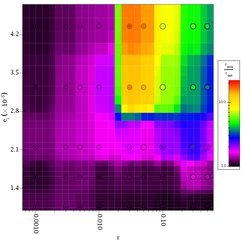
The results of these simulations can be summarized in four different plots. These plots show the data points along with an interpolated surface from the data points in the tau vs. eccentricity plane. The data points are drawn as colored circles. There is a dark outline around groups of circles with the same tau and eccentricity values. The size of the circle reflects the size of the particles for the simulation. So each black circle will have at least two colored circles inside of it. Often they are so close in color that you won't be able to tell there is more than one. The first plot shows the minimum width of the ring in each of the simulations.
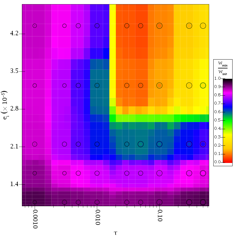
This image shows that the negative diffusion process does not change the width much when either the optical depth or the forced eccentricity are too low. The most significant contraction of the ring occurs around an optical depth of 0.03-0.05 with a forced eccentricity of 3e-5 or greater. What might surprise some about this plot is that when negative diffusion is most effective, the width of the ring can be cut by more than on order of magnitude after only a single pass by the moon and, as was shown above, the majority of that change happens very quickly. The location of maximum effect is also seen in the next plot which shows the maximum optical depth attained in the simulation divided by the maximum optical depth at the beginning of the simulation.
Here we see that the maximum optical depth can also be enhanced by more than an order of magnitude. This might lead one to wonder how high the optical depths can get. The next plot shows the maximum optical depths attained in each simulation.
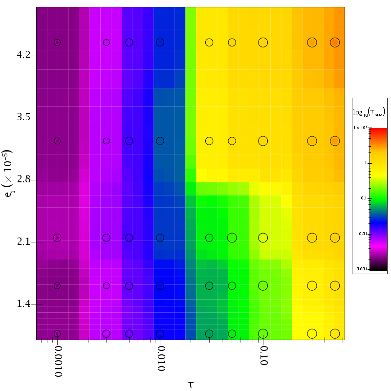
Here we see that the maximum optical depth keeps increasing as the average optical depth and the forced eccentricity increase. The key point to note here is that this process can get the optical depth at the core of a narrow ring to be well above the unity. The points in the top right corner of the plot are almost all above an optical depths of 2 with a highest value of 3.8.
The last plots of collected data looks at the efficiency of the process. The migration by collisions can't move particles farther than the radial drift induced by their forced eccentricities. This plot shows the change in the width divided by the magnitude of these excursions from the semimajor axis. This is basically a measure of how efficient the process is.
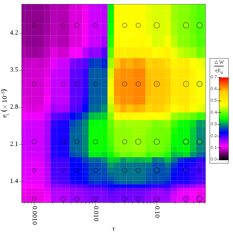
Here we see an island in the middle of the plot with a high efficiency. Unfortunately, it isn't clear if the lower values at the top of the plot are real or not because the original ringlet was only 2.2e-5*R_0 in width. Eccentricities higher than that might require broader rings in order to properly measure the efficiency. Still, there are several remarkable things about this plot. At the peak, the ring width is decreasing by 60% of the forced eccentricity. That is incredibly efficient. Equally impressive is that the majority of the parameter space has an efficiency of 25% or higher.
Mechanism
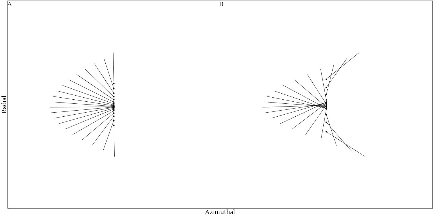
The mechanism that drives negative diffusion is a systematic drift in guiding centers that occurs when the streamlines begin to shear through one another. At that point, the particles move through the wake peak three times. The first time is the wake peak overtaking them, then they move back through with the wake peak and finally the wake peak moves on past them. The figure below shows a column of particles with lines drawn to where their guiding centers would be. The A frame is the last wake peak before the streamlines begin to shear through. The B frame is after the shear through.
There is an animation showing this same simple model of the system as the particle propagate downstream. One of the particles in this has been highlighted to help the viewer see its motion. (Divx encoded MPlayer movie) We also have an animation showing the velocity components. (Divx encoded MPlayer movie)
Simulation Velocity Curves
This movie shows the optical depth and guiding center optical depth surfaces for the simulation with optical depth 0.3, particle radius of 6.5 m, and initial forced eccentricity of 3.24e-5. When watching the movie, note how the velocity curves mirror the cartoon model, particularly right before and right after the streamlines intersect.
Animations
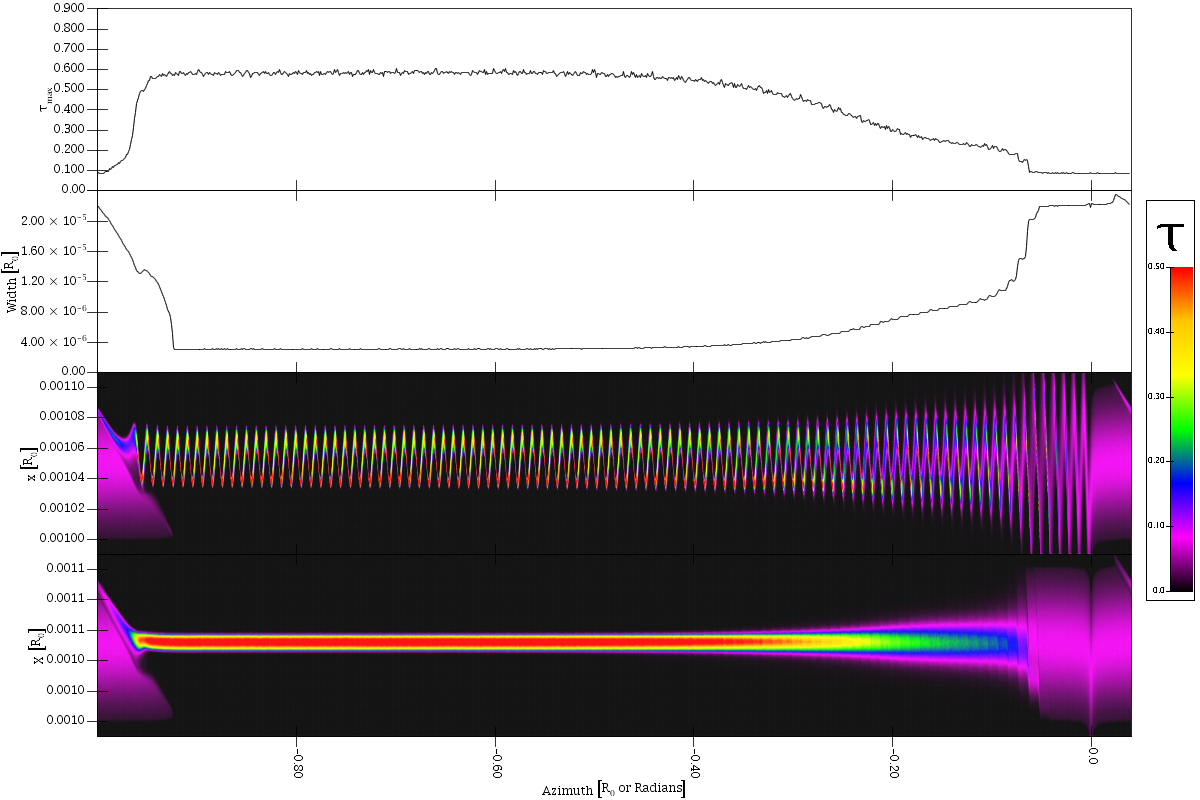
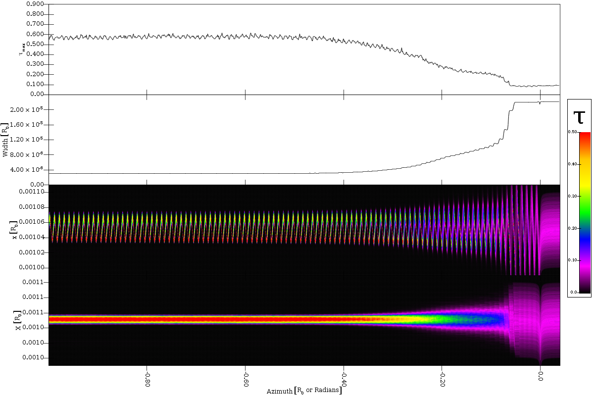
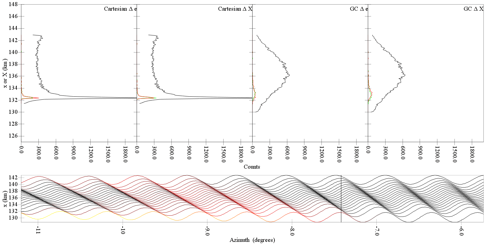
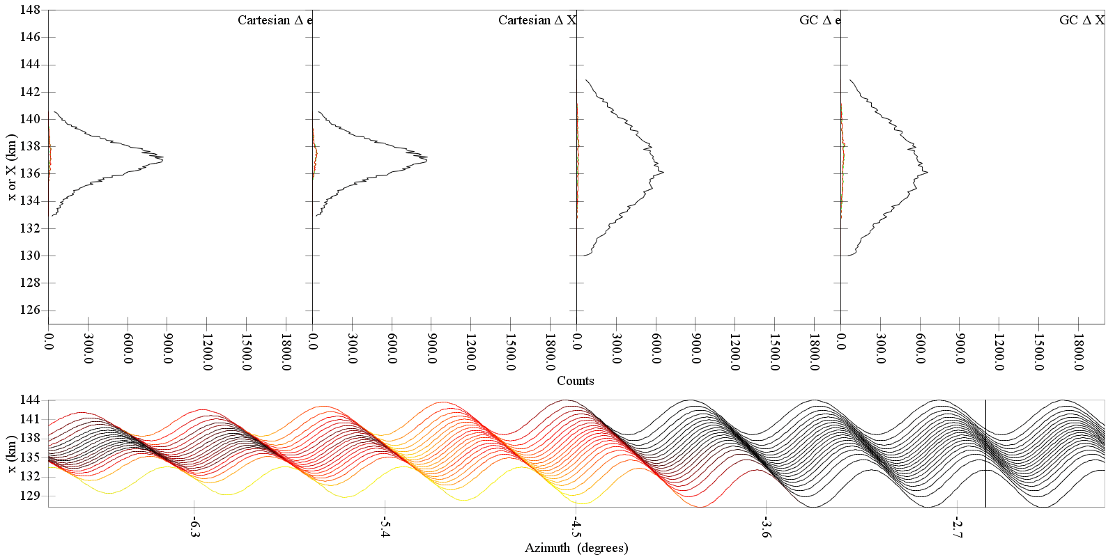
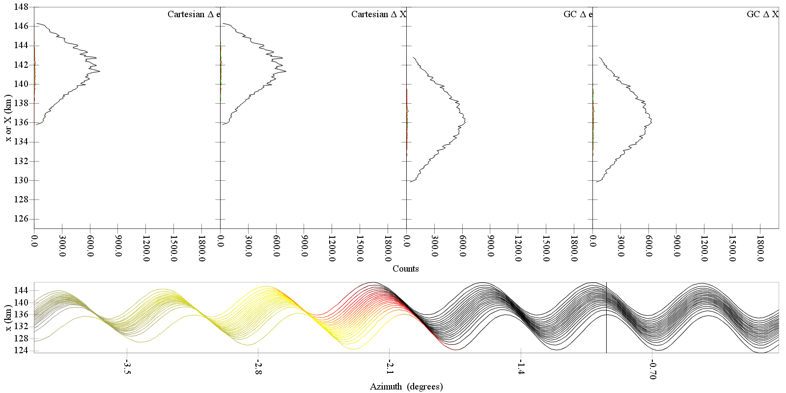
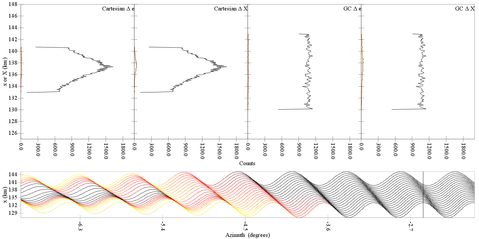
These are animations that show how negative diffusion occurs. Four different simulations are presented and each animation shows several wakes passing through the simulation cell. The aminations begin with wakes prior to Y=Y_crit, the location of kinematic streamline corssing, where the distribution of semimajor axes is not significantly modified then runs through the Y=Y_crit region where the process is seen to be effective. The frames of the animation show five different views of the data. The bottom region displays particle streamlines colored by the ratio Y/Y_crit. They are black when this value is less than 0.9 then turn red from 0.9 to 1.0. If the eccentricities do not damp enough to keep Y less than Y_crit, the color goes from red to yellow up to a value of 1.1 then from 1.1 to 2.0 it changes from yellow to blue and remains blue above 2.0.
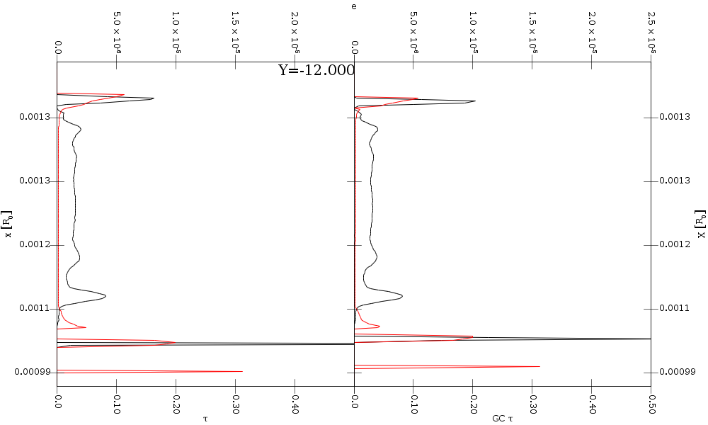
The top panel shows four different plots of data binned along the radial axis using either Cartesian or guiding center coordinates, x or X. In each of these plots there is a black line showing the total distribution of particles as well as a red line and a green line. The red lines are counts of particles for which the value of e or X is decreased over the next 50 time steps while the green line is counts of particles for which the value has increased. In these simulations, e and X are constant unless the particles undergo collisions.
Some things to note about these animations. First, very few collisions occur outside of the wake peaks. Second, the wake peaks prior to Y=Y_crit have collisions and modify particles, but not in a systematic way. In those wake peaks, the number of particles moving inward is roughly equal to the number moving outward at all distances and the number losing eccentricity is roughly balanced by the number gaining. Once the streamlines intersect however, the collisions in the wake peaks now systematically lower eccentricity and do so in such a way that particles above the wake peak systematically move down and those below the wake peak move up. The way in which this distrubance propagates through the region leads to the negative diffusion.
| Optical Depth | Average Forced Eccentricity | Particle Radius | Radial Particle Distribution | GIF | Divx AVI |
|---|---|---|---|---|---|
| 0.03 | 1.07e-5 | 6.5 m | Gaussian | 17 MB | 9 MB |
| 0.03 | 2.15e-5 | 6.5 m | Gaussian | 20 MB | 8 MB |
| 0.03 | 4.25e-5 | 6.5 m | Gaussian | 22 MB | 9 MB |
| 0.03 | 2.15e-5 | 3.9 m | Square | 21 MB | 11 MB |
Uniform Distribution
At the urging of one of our reviewers, we performed an extra simulation with a radially uniform distribution of particles that was broader than those used above. The purpose of this simulation is that it shows the build up of enhanced edges with enough separation that we get two separate boundary layers with a generally unaltered region between them.
The figure below shows a surface plot of this simulation. The different panels show the geometric optical depth as well as the guiding center optical depth and the guiding center binned eccentricity. The standard signature of negative diffusion is present here as well with modifications of the particle semimajor axes (X) beginning when the particle streamlines intersect. The difference is how they are modified. Click to plot to get a much larger image that shows longer in the simulation.
To make the exact nature of the modification more
clear, the figure below shows a slice through the guiding center
optical depth. There are enhanced density regions at both the inner and
outer edges. The eccentricity also stays larger for longer in these
edge regions. The formation of the inner edge happens earlier as Y_crit
is smaller due to both X being smaller and e being larger. The
formation of the inner edge is basically particles moving away from the
empty space beyond the ring into the region of higher density. To
balance the outward motion of the particles right at the edge, a low
density region forms inside of that. As the term negative diffusion
implies though, particles will move away from low density regions and
into high density regions if they still retain enough of their forced
eccentricity and organized motion. At the inner edge this is the case
so particle pull away from the low density region to form a second
peak. You can watch an animation
showing the evolution of the system
as well. This movie is very large, but shows a lot of information about
the system and how it evolves. To only see the slices through the data
view the movie linked to on the image below.
As a last use of this broad square simulation, we will give an indication of why this paper does not consider simulations beyond one synodic period. This particular simulation was allowed to run into the second synodic period. The figure below shows what happens.