Histograms and Bar Plots
This tutorial deals with plots where your data is represented with boxes. The one you are most likely to use in the analysis of your Swift data is the histogram style. Because we'd like users to be able to meet all of their plotting needs in SwiftVis, we have also added a bar style plot that is suited for doing plots with groups of bar. While this isn't the most natural thing to do with your normal Swift data, it is a type of plot that people occasionally need and it fits in nicely with using a general data source or the element table editor.
Let's begin by looking at a histogram plot. For the simplest usage of this we will start by loading in a bin.dat file and passing the results of this through a binning filter. For this example we'll just do a 1-D binning over the eccentricity with 100 bins and do the count of the number of particles in a given eccentricity bin. This is then passed to a plot where a Histogram data style has been added and the default scatter plot has been removed. The first figure here shows what the main SwiftVis window looks like at this point with the histogram options showing.
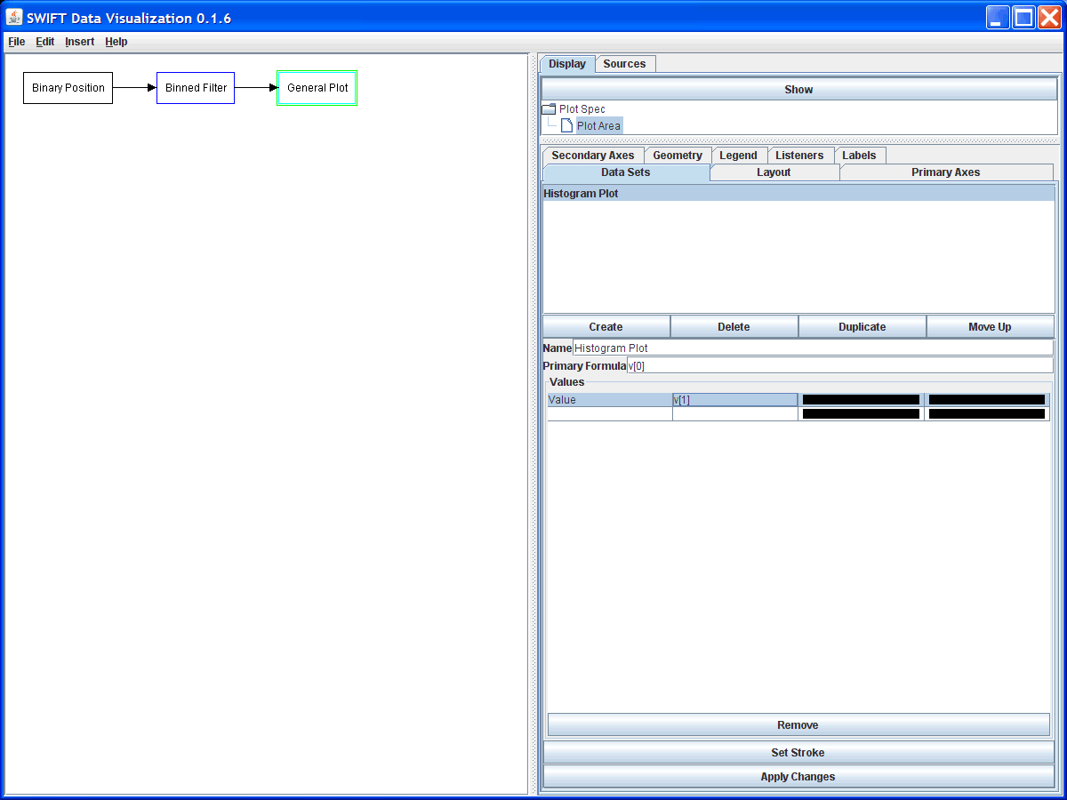
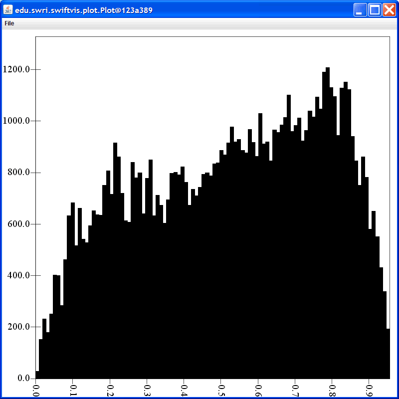
The options for the histogram plot are fairly simple. You can give the plot a name and you get to specify the formula that will be used to get the primary axis value. If it is coming from a binned filter this will be v[0], and that is the default. Note that this formula doesn't have to have values that are uniformly spaced, or even monotonically increasing. However, that plots you get if those things aren't true might be a bit odd. Below the primary formula is a table for setting what values are used for the height of the bars. This defaults to having one value that is called "Value" and is always 1. In this figure we have changed the formula for the value from the default of 1 to v[1] which is the count value from the binned filter. You can edit these fields by simply clicking on that cell in the bale and typing. Following the column for the values are two columns that by default are filled in black. These are the colors used to fill in and draw the outlines for the histogram bars. You can either click on them, or press space when they are selected in the table, to edit the color. The figure below shows the plot created at this point.
The bar value information is displayed in a table because this plot style allows you to have multiple bars stacked up in the plot. If you edit anything in the last row of the table, it creates a new bar that will be stacked on top of those before it. The remove button will remove the selected bar, assuming more than one is left. The stroke that is used to outline the bars can be edited by clicking the "Set Stroke" button.
To illustrate the use of colors and multiple bars, assume that we wanted to know the distribution of eccentricities, but we wanted to know how that distribution was related to the semimajor axis values. For example, perhaps you wanted to know the distributions inside of a certain semimajor axis values as well as that outside and how they contribute to the total. To see this we will rearrange the main grap a bit and place two selection filters after the binary position source. We will then copy our binned filter and have each of the selection filters feed into one of the binned filters. Last, both binned filters will feed into the plot. For this to work properly, we have to make sure that both of the binned filters are binning over the same range. So we turn off the auto range feature and set them to go from 0 to 1. The figure below shows that results from doing this.
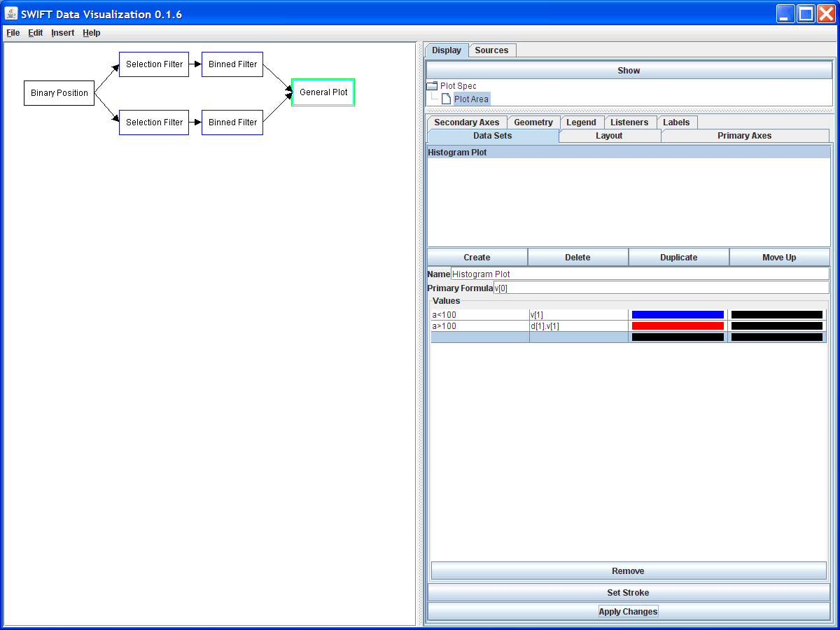
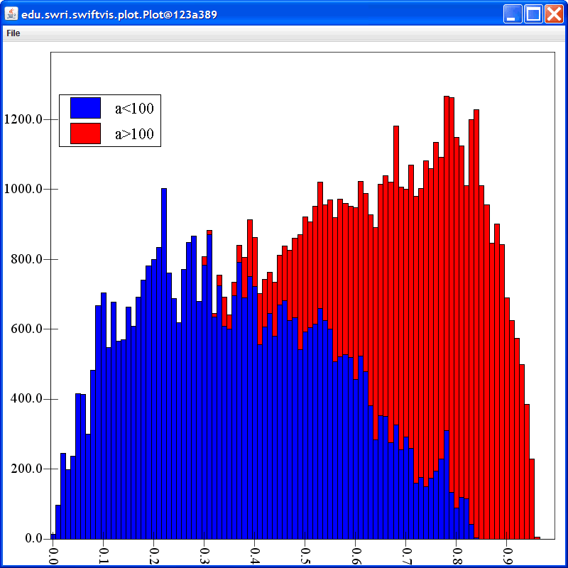
As you can see, we have also updated the values in the histogram plot so that not only are we plotting the data from the first binned filter with blue boxes, we have stacked the data from the second binned filter on top of it using red boxes. By turning on the legend for this plot and moving it to the top left corner produced the plot shown below.
We also have a full description of all of the options in a Binned Filter if you aren't certain how to use it.
A second plot style that is very similar to the histogram style is also available in SwiftVis. This is the more general bar style. Bar style plots aren't as common for plotting scientific data, but there are times when they are needed so this plot style makes it possible to do them in SwiftVis. The bar style shares a lot of features with the histogram style, but it is intended for data that is more text labeled instead of having numeric values. Since SwiftVis is intended for working with numeric data, you'll do some things differently for any plot you make using the bar plot option.
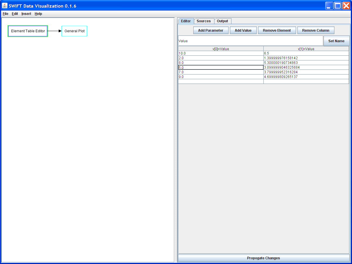
For this example we will use an element table editor to allow us to enter some values that we want to plot up as bars in a bar plot. This example is based on a plot that might have been used in demonstrating the advantages of multithreading SwiftVis on a machine with multiple core/processors. The figure below shows the setup. Basically we have an element table filter as the source so we can use it in a manner similar to a spreadsheet. You can see that we have two value columns and each one has siz elements. The intension here is that each row represents a different type of timing measurement and the first column is the normal timing while the second is the timing with two threads.
In the plot we have created a bar plot and removed the original scatter plot. The options for the bar plot are a bit more complex than those for the histogram plot. The next figure shows those after we have made some changes for this particular plot. The first option, as is standard in SwiftVis, is the name of the plot style that we want displayed in lists. The second option is a checkbox where we can select whether we want the bars grouped by element or not. The bars in the bar plot are grouped into one or more separate groups with each group having one or more bars in it. If this option is selected, then each element will be a separate group and the number of bars in it will be determined by the bar characteristics we set up below. By default, this option is true. When it is false, the groups are determined by the bar options and each element will be a separate bar inside of the group. A more explicit example showing how this matters is given below. It is turned off first to illustrate this.
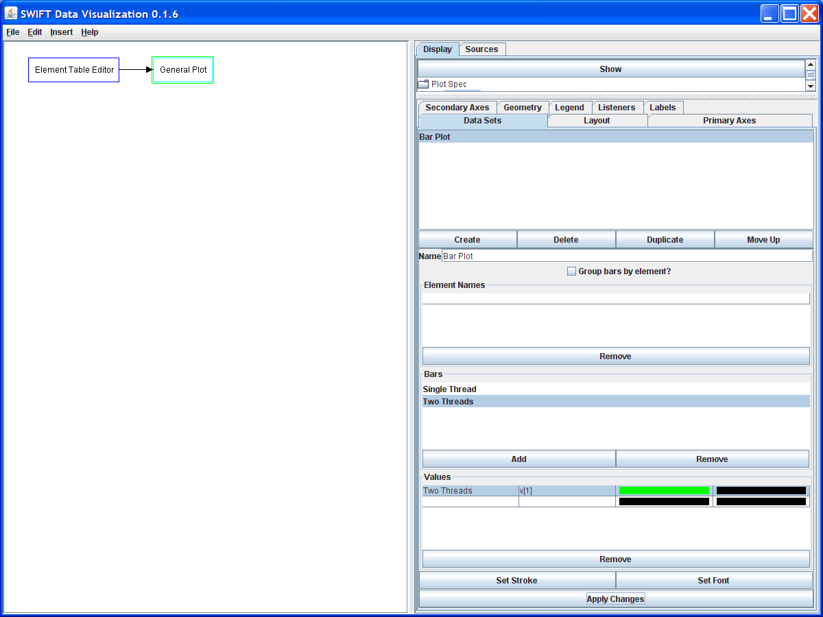
After the option specifying how things are grouped comes a table where you can specify what the labels should be for each element. Currently this is only used if the bars are grouped by elements. Here you can see those strings haven't been specified. This is needed because SwiftVis elements don't normally carry any string information. If a string is going to be associated with each element that has to happen here in the plot information. Any elements that you don't provide a label for will not display anything.
Below the element names are settings for the bars. The first list lets you specify how many bars each element will produce. If the things aren't grouped by elements, they will be grouped by this instead. Unfortunately, this option isn't very effective currently because there isn't a good way to indicate which element each bar is associated with.
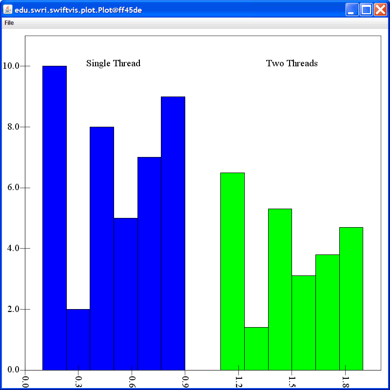
For each bar, you get to specify multiple values that will be stacked up. This is much like the histogram options for stacking things. Different colors can also be selected for each bar value in the bar. These are shown in the legend if it is drawn. The figure below shows what happens with this configuration.
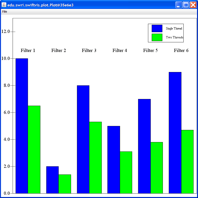
To give this plot more meaning we should set it to be grouped by elements, add text for the elements, take off the values from the primary axis, and display the legend. Making all of these changes produces the plot shown in the figure below. The change where we have one blue and one green bar in each group is the result of grouping the bars by elements. The maximum value on the secondary axis was also increased so that the legend would not overlap with anything that we care about in this plot.
Bars can also be stacked if multiple values are put under a particular bar option. The different colors for the values will appear in the legend in the same way as they did for the histogram plots.