Clickable Tools
The main motivation for SWIFTVis was to provide a method for researchers to easily load in and analyze SWIFT and SWIFTER data sets. One of the examples for this came from programs that were written for other simulations that allowed the easy viewing and manipulation of data sets with plots that could be clicked on to view different areas. The features we have talked about to this point provide a lot of power, but you have to interact with them by going to properties panels and type in information. One of the more advanced features of SWIFTVis is the ability to create "Clickable" tools, in particular, filters. Fliters can also be written that take input from the user when the user clicks on a plot or presses keys after clicking on a plot. These filters can be used to design efficient tools for analyzing data. Setting them up properly take some effort and the ability to save them off as templates and reuse them is critical.
The filters that take plot click input are added to the graph the same way as any other filter. The provided ones have the string "(Listener)" after their description that you will see when you add them. Other users should follow this pattern if they create clickable filters. The Plot element has a tab called Listeners that is only of use if the graph containers one or more of these listener filters. To see how we use this, we will go through the process of building an analysis tool in SWIFTVis that plays the same roll as a ring analysis tool that helped motivate the creation of SWIFTVis (the original tool lacked flexibility though and could only be used with one specific data type while SWIFTVis can be used with many data types). This tool actually has a number of different views of the same data set, and two different clickable filters. The idea is that we are dealing with a large data set and we can't view the whole thing with any decent resolution. However, we want to easily see where we are in the full plot so we make one large plot that shows a thinned version of the information. Clicking on this plot selects the region that is viewed at full resolution in another plot. Both of these first two plots are surface plots. The second one is also clickable, and clicking on it takes a slice through the surface and the values in that slice go to another plot showing those values.
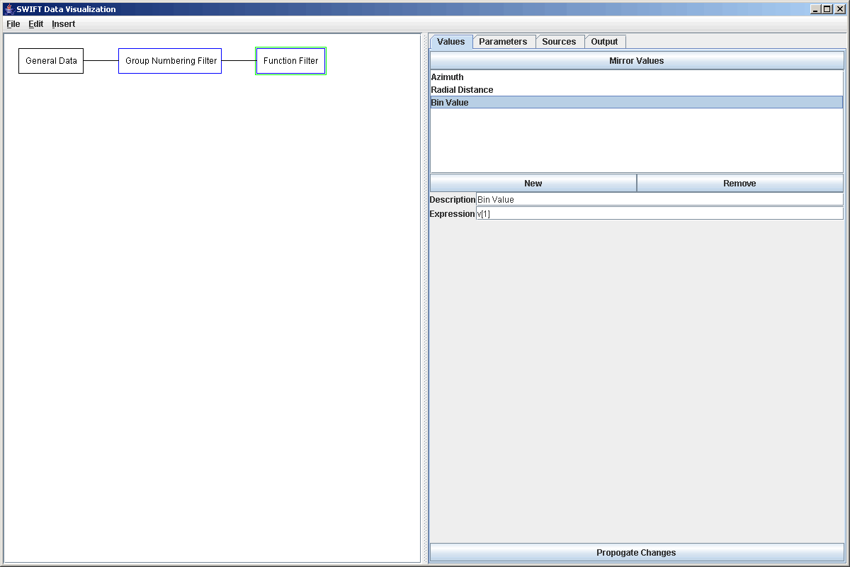
To begin the process of making this we'll start with a General Data source. The data files we are using are the same as in the first example of the General Data source tutorial. As with that example, we need to follow the general data source with a Group Numbering Filter. After numbering the groups, we will put in a function filter because for a reused tool, we want the radial values to actually be more appropriate than the group numbers and we will be sending these numbers to multiple locations so calculating them in a function filter makes sense. That also allows up to take out the group number parameter which we don't need and put our values in the order we want them. The figure below shows the properties of the Function Filter.
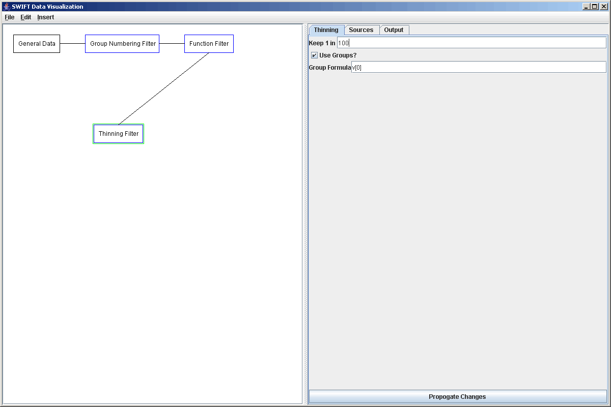
We will then connect ththe Function Filter to two different Filters. The first filter is a Thinning filter. This filter can be used with or without groups and takes one in a specified number of elements or groups. In this case, we want to take full groups so we select to use groups and to thin the data out signifcantly, we will keep only 1 in 100 of the groups. The properties panel for this is shown below.
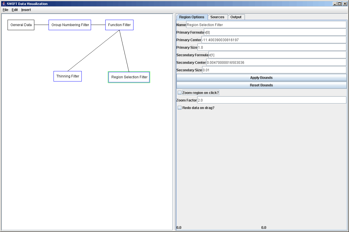
The second filter that we want to add in is the one that will feed into the second, high resolution, surface plot. This filter is going to be a clickable filter. Currently there are only two filters of this type in SWIFTVis. One allows you to select rectangular regions in a plot, and the other allows you to take slices. We will demonstrate the use of both here. This first filter could have been done with either, but we will use the region selection version. To do this we add a Region Selection Filter (Listener) to the plot coming off the original source. The properties of this filter are shown in the plot below. They start by making a region big enough to include all the data. We will go ahead and make the size on the primary formula a lot smaller and the size on the secondary formula a bit larger. You will see why later. We will also turn off the "Zoom region on click" option. This is mainly useful if we are adding a listener to the data path in front of the plot it connects to. So we would use it if we simply wanted to be able to zoom in on the data we were looking at. In this case, we want to select regions of a larger plot to send to a smaller one.
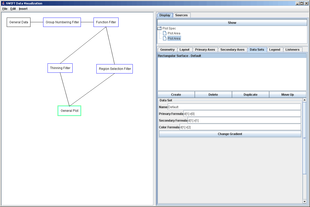
To see how this can work, we will go ahead and create a plot element in the graph and connect both of our current filters to it. We will then add two plot areas and adjust the geometry settings so that both plot regions are visible. We'll leave a hole where the third plot region will go. For each of those plot areas, we need to go to the Data Set tab and replace the Scatter Plot with a Rectangular Surface. For the plot coming from the Thinning Filter, we can leave the default value in place. For the plot coming from the Region Selection Filter, we need to prefix the three formulas with d[1] so that they come from the second source (we connected the Region Selection Filter to the plot after connecting the Thinning Filter). This is shown in the figure below.
At this point we could click the show button and see the two different plot areas, but before doing that we should add in our listener to the plot. Click on the top Plot Area, the one for the data coming from the Thinning Filter, and then click on the "Listeners" tab. Click on the add button. Because we only have one listener is the graph right now, you just select OK. Now that listener has been added to listen for click on that plot. Notice that the listener is listening to one plot, while the listener itself is sending data to another plot. The figure below shows the plot window after we have clicked on the higher azimuthal end. The listener, by default, places a highlighed box over the region that is being selected. So the top plot area is showing a higher resolution version of the data in the highlighted section of the lower plot.
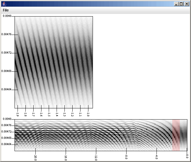
The highlighted region can be moved simply by clicking on the lower plot. That is the power of the listeners, the ability to interact with the plots directly instead of having to go back and input information into the filter property panels. Because we picked the region selection filter, if we were toclick and drag, we would get a new box that would be displayed. Unfortunately, this would reset the sizes of the selection region, but we could reset those by going back to the properties panel of the Region Selection Filter. Using a Slice Selection Filter in this place would have removed this possibility.
Now what we want to do is put in another listener and have it so that when we click on the top plot area, it takes a slice through the data there and plots that in a 3rd plot area. The Slice Selection Filter can take 3 different types of slices and what type you do depends on the settings in the properties panel. You can take vertical slices (perpendicular to the primary axis), horizontal slices (perpendicular to the secondary axis), or you can take general slices where you click and drag to specify the endpoints of the slice. For this example we picked to do a hoizontal slice. We don't really need to set the point(s) of the slice (Primary Value 1, Secondary Value 1 is a point), but we do need to specify the width of the slice. For the horizontal slice on this data set a width of 1/100th of the simulation width or 0.000002 was appropriate. The figure below shows the settings of the Slice Selection Filter.
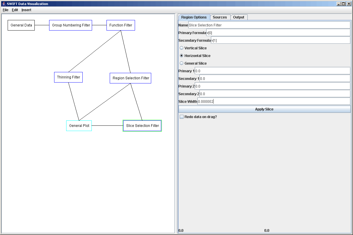
The Slice Selection Filter adds two values to the data points that it selects. This is significant for what we decide to plot. The first value it adds is the distance of the data point from the line. This way you could weight things by how close they are. The second one is the position down the line. If a vertical or horizontal slice is taken, this is either the primary or secondary value of the point, whichever is along the line. If a general slice is done then it is the distance of the closest point from the data point on the line down from the first point of the slice. If a general slice is taken and the user clicks, then the selection region is a circle and the offset value is the atan(secondary_offset,primary_offset). In our case, we are taking a horizontal slice, so that offset value is the primary value of the point. For the plot, we simply do a scatter plot with the primary axis being the offset and the secondary value being the binned value (v[4] and v[2] in this case). We connect it with lines, add the slice listener to the hig resolution plot, and when we click on the high resolution surface plot, we get something that looks like the figure below.
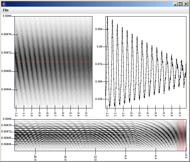
Notice the red highlight showing what is being selected for the slice. In the slice panel, we can see the oscilation of the optical depth as the wakes strengthen in this simulation. To complete things, we could select everything in the graph above except for the General Data source and do File > Save as Template. That template would then become a tool that we could use in the future without having to build the whole thing again. Also, in this situation, we decided to look at only one data set. We could just as easily have put multiple surfaces and multiple slices up by adding in more listeners. The surfaces could have been overplotted using gradients with alphas, or we could have make the secondary axis count in that plot be greater than one (though we wouldn't actually need to create additional secondary axes) and then have shown the surfaces one above the other. We could also have attached a different lslice listener to each surface plot and shown more than one slice. The complexity we could create for our tool is quite high and the ability to save it off and reuse it would make the original construction effort worth it.
It should be noticed that this tutorial consumed a large amount of memory. It was made on a laptop with 512MB of RAM and Java had to be run with the flag -Xmx300M to allow it to use 300MB of memory. The reason for this is actually the use of the Group Numbering Filter and the Function Filter right at the beginning off of a rather large data set. Each of those filters actually alters the elements so it can't jsut reuse the elements from the previous source. Using an alternate data file that doesn't need that would actually be superior to what was done here, but on the positive side, SWIFTVis is capable of dealing with these very specific data files. Also, if this had been done on a real workstation with 1GB or more of RAM, it is likely that this comment wouldn't be here because SWIFTVis would probably have been run with -Xmx1000M and no performance issues would ever have been noticed.
The clickable filters provided with SWIFTVis also have another feature that was not displayed in this tutorial. At the bottom of the properties panel for each of them you might notice that there are two numbers. When the mouse is moved over the plot that is being listened too, those numbers display the primary and secondary values of the mouse pointer location.
So this is a nice example of how clickable filters can be used with a rings data set. What about in the case of SWIFT or SWIFTER data? Going back to the Movie Filter tutorial, we could very easily edit that example to use one of the clickable filters instead of the Movie Filter and have one plot that we click on to select the time range that is used for binning. The example of using the slice filter can be done for any surface plot, including the e vs. a surface plots that we have looked at previously. While the colored surface images are nice, often having a slice through the data can help when looking at the details.
To illustrate this, we can revisit the earlier example of making a binned surface plot of e vs. a from a bin.dat file. It can also allow for a more complete demonstration of the abilities of the slice filter. To being with, we add in our Binary Position source and point it to the file that we want to read. We send this to a Binned Filter and bin over the v[1] (a) and v[2] (e) values. This time, in addition to doing a count, we will also find the average value of i in the plots, just to demonstrate the ability. The figure below shows this set up with the properties of the Binned Filter being displayed.
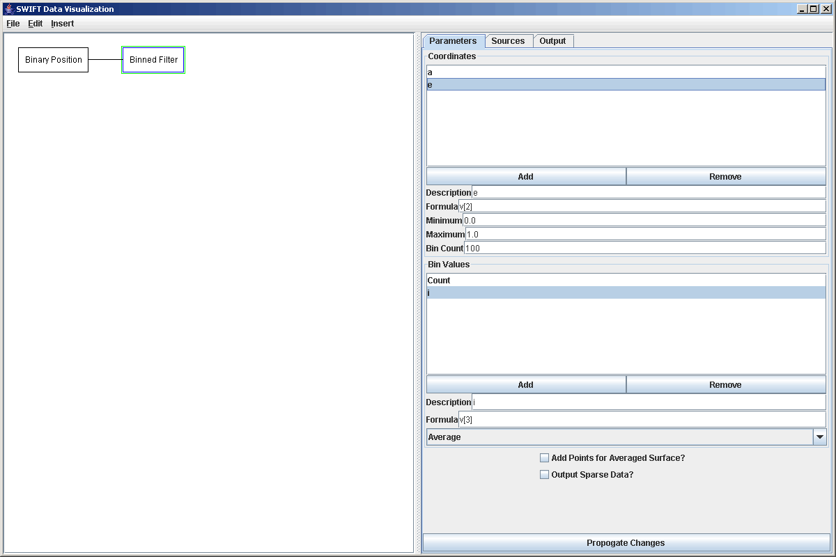
We will send the output of the Binned Filter to two different places. One will be to go directly to a Plot, where we will use a Rectangular Surface plot to show us the binned surface as we have done before. We will also send the Binned Filter data to a Slice Selection Filter and as before, the default values will work with the exception of the slice width. Now we connect the Slice Selection Filter to the plot and add a second plot area, adjust the geometries so that both show, and set the values in the new scatter plot to plot d[1].v[5] vs. d[1].v[2]. The v[5] is because we put in a binning on the inclination which added an extra value in front of the distance and offset that were put in. The d[1] is required to tell it to pull the data from the Slice Selection Filter. Lastly, we need to add the Slice Selection Filter as a listener on the first plot area. The figure below shows the plot this produces after clicking on one location.
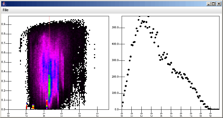
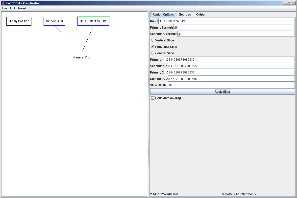
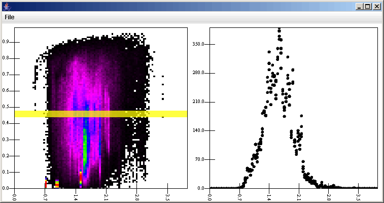
The vertical slice is rather difficult to see here. To make it more visible, we can go to the listener tab, click on the SliceSelection Filter, and change the color. So see what it does, we can also change the direction of the slice. The figure below shows the SliceSelection Filter properties with the Horizontal option selected. Now, when we click on the plot, we get a slice of constant e. Because the e axis is shorter, we might also want to change the slice width, but in this case it doesn't really matter.
What this does in the plot is shown below. Notice the change in the color of the slice marker and the thickness when the slice is taken horizontally. In the plot on the right, there are actually multiple points at the same a value because the slice covers multiple rows.
The last option that we can try is the general slice. This option allows us to click, drag, and release. The slice is taken along the line connecting the click and release point. The figure below shows the plot using this option.
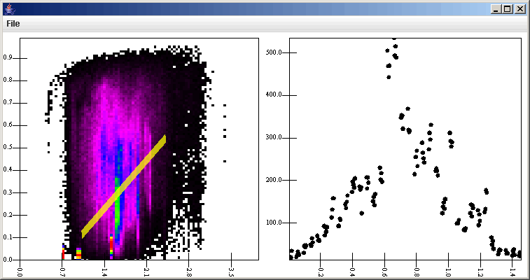
Note the offset coordinate in the right plot. It measures from the beginning of the slice to the end using a cartesian distance on the plane of the plot. In all of the bin.dat examples so far we have used the particle counts to see the density of particles in different orbits. When we made the Binned Filter, however, we also told it to bin the average values of the inclination. That value has been in v[3] in the graph elements that follow the Binned Filter. By changing the two plots to plot v[3] and d[1].v[3] instead of v[2] and d[1].v[2], we can see the average inclinations instead. For the surface plot, this also required changing the gradient range to go from 0 to 2. The plot this produces with a general slice across the middle is shown below.
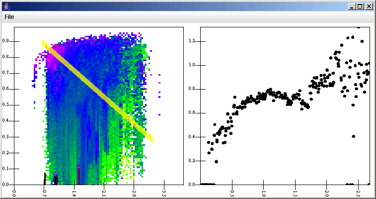
In all of these examples, we have been putting multiple plot areas on one plot. It is equally valid to create multiple plot objects instead. Clicks in one will still produce changes that appear in the others. In this case the author simply prefers to have the information all displayed in one window.
At reading this tutorial, you should understand how clickable, or listener fliters work in SWIFTVis and how you can use them to build visual tools for quickly analyzing data by viewing different aspects of it quickly. Our last tutorial covers the options in SWIFTVis and how you can extend the SWIFTVis package beyond what is provided in in the normal distributions by adding your own graph elements or plotting styles that have whatever features you find useful.