Movie Filters for Viewing System Evolution
While the selection filter allows you to select just about anything that you wanted from a data set, it can be cumbersome for some tasks. An example of this is when you want to see how your system evolves over time. The selection filter will let you pick different time intervals, but editing the formula repeatedly can remove the contiunity that often helps for seeing trends. For this reason, SWIFTVis includes a filter that will systematically run through a dataset pulling out elements in order that we call a Movie Filter. The name stems from the fact that it allows you to watch the evolution of the system as a movie with the plots changing as now slices are taken. To see how it works, we will continue with the example from the previous tutorial. We need the Binary Position data that we will pull of into another filter or two before plotting.
The filter that we want to add after the Binary Position data is a Movie Filter. This filter takes the input and passes a small piece of the input through to the output. You can see the properties panel for it in the figure below. The filter takes sequential elements from the input and passes them on. You can control how many elements are taken with the first field. The second field lets you specify how many to advance between frames. By default, these numbers have units of single elements. However, you can also tell the filter to "Use Groups". In that case, the numbers in the first two fields are not numbers of individual elements, but instead groups of elements. A group is determined by a sequence of elements that have the same value for some expression given in the group formula. In this case, the group formula is v[0] because that is the time variable from a bin.dat file. This means that we pull all the elements from a timestep together and advance by full timesteps. In this case we are actually passing through all the elements from 10 timesteps and advancing one timestep each time.
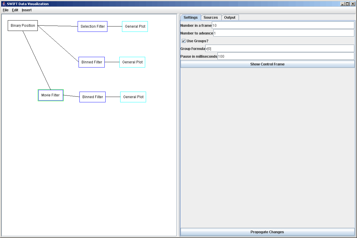
The movie aspect comes in with the last two elements on the properties panel. We can set how many milliseconds we want SWIFTVis to pause in moving from one frame to another and we can bring up a control frame for running the movie. The control frame is a very simple little frame with one button and a slider showing progress through the data set. We can move the slider manually, or we can press the button to start it moving automatically and press it again to stop it. The control frame is shown in the figure below.
![]()
Of course, we can't see what is happening very well until we send the information to a plot. As you can see in the figure above, we will be sending this data through a Binned Filter like we did for the previous tutorial, then sending that to a plot. Follow the same direction that are given in that tutorial to accomplish this. For the figure to look reasonable doing 30 by 30 bins is good and we probably want to chang the settings so that we take 100 timesteps instead of 10. That will give us slightly better values for our statistics. Once you have done this, you can bring up plot and the control frame and click start to watch the movie. You will probably have to adjust the maximum on the gradient so the stretch is appropriate. For our data set having the maximum at 100 looked nice.
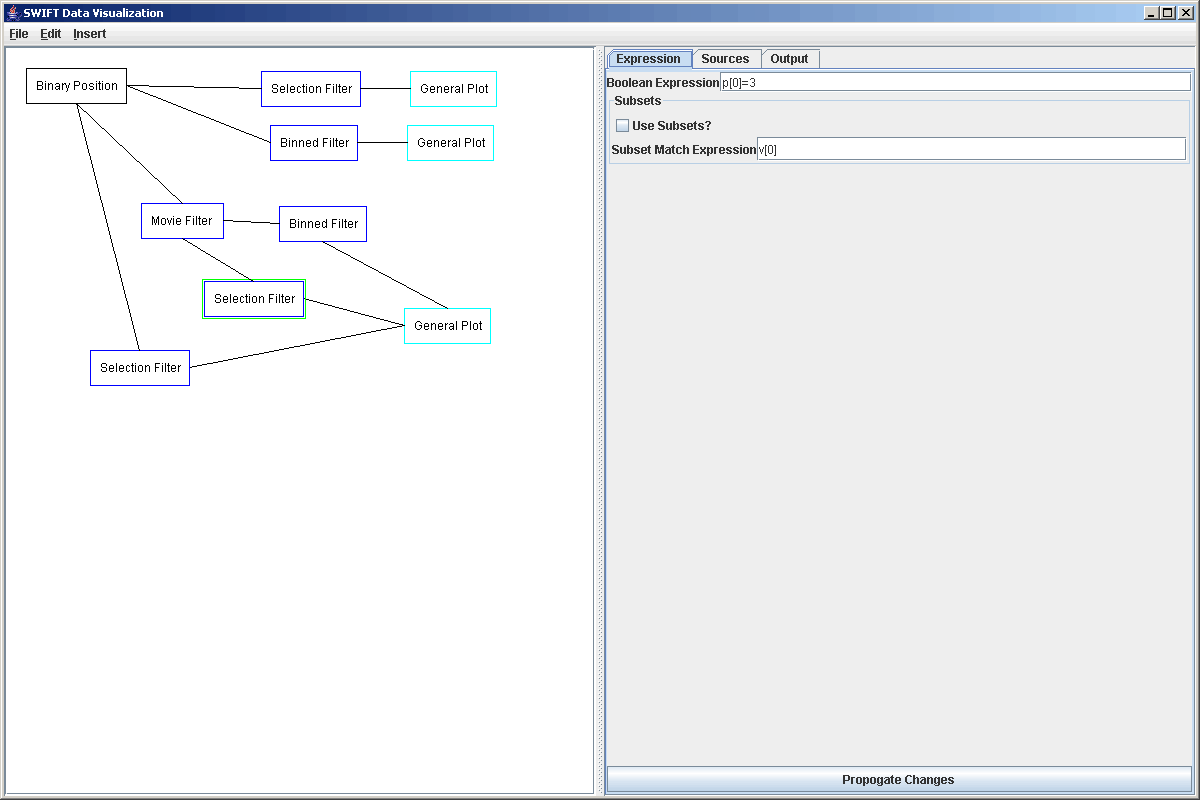
So this shows you the time evolution of the system and the slider frame can give you some idea of where in the simulation you are. Just to show the flexibility of SWIFTVis and to let you see the non-linear data paths that we can make, we will enhance this some. So far, all of our examples basically have had one flow of data that goes straight from the source to a plot. While this works well for many things, that is a limiation that we don't have to put up with in SWIFTVis if we want to do something more complex. What we will do now is set things up so that while we are watching the binned value evolve over time, we can also see a scatter plot of the data for one or more particles and have a highlighted section showing what fraction of the data is being pulled for the movie. The scatter plot will be displayed in the same way as what was set up in the first tutorial. We will take several steps to do this. We'll start by adding in the extra filters for more data paths. Everything will go to the same single plot, but we will have 3 sets of data going into our plot at the end. What we want to add are two selection filters as shown in the figure below. One of these filters pulls data directly from the source and the other takes data from the Movie Filter. Each filter will be set up to pull out one or a few particles. We'll stick with one particle here. Both should pull out the same particle.
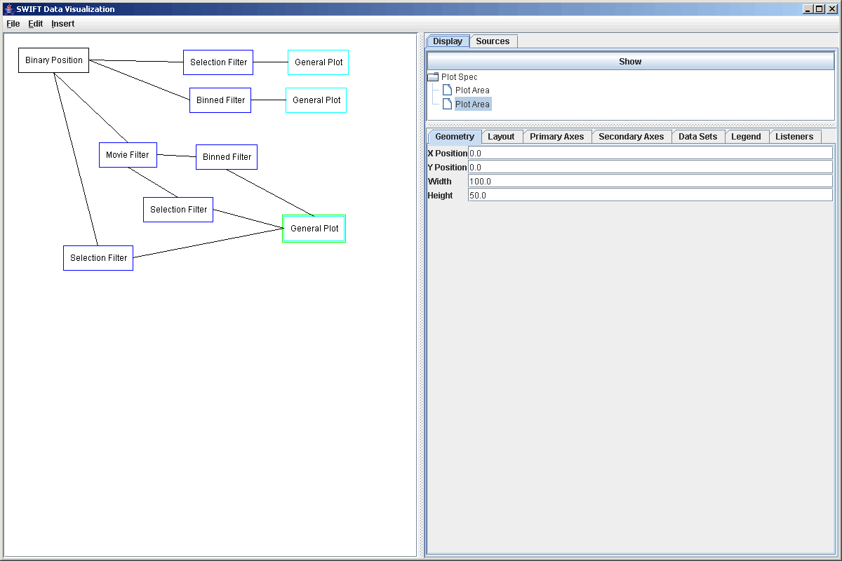
We happened to connect the lower selection filter to the plot before the upper one. That doesn't matter other than it means the one that doesn't go through the movie filter is d[1] and the one that does is d[2]. Now we select the plot, click on the Plot Spec, and do Add Plot again. This will add a second full plot area to the plot. To make it so that we can see both of the plots, we need to adjust the values in the Geometry tabs of the two plot areas. The values in these fields are in percent of the full plot. By default, the plot takes the entire region, starting at 0,0 and having width and height of 100. We want to leave one plot and 0,0 and put the other at 0,50, then set the height of both to 50. The values in these fields use typical screen graphics coordinates so while x grows to the right as expected, y is zero at the top of the window and grows down. Below is a screen shot showing the second plot area selected and the values entered into the Geometry tab.
If you look at the plot now it has two regions and by default the new one is showing a scatter plot of the grid points in the binned grid. That is because it starts with a scatter plot that by default has the formulas v[0] and v[1] which take data from d[0], our binned data. What we want to do is go to the Data Sets tab of the new plot area and make a few changes. First, click on the scatter plot that is there and change Primary Formula to d[1].v[0] and the Secondary Formula to d[1].v[1]. Now that pulls data from the selection filter that comes directly from the full data set. If you click Apply Changes you should see the semimajor axis data for your selected particle as a function of time. This is shown in the figure below.
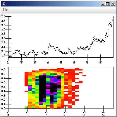
Second we want to add a new Scatter Plot to this same plot area and set the formulas in it to be d[2].v[0] and d[2].v[1]. This pulls data from the selection filter that is coming off the movie filter. To make these points visible, we click on Change Color and pick something other than black to plot the points as. You could also choose to change the shape used or make the shapes bigger by altering the Symbol Size. Here we have picked red as the display color. To make this scatter plot show up, we simply go to the Layout tab and add the new data set to the plot cell. Now you should see some of the points at the beginning of the upper plot highlighted. The figure below shows what we get for this.
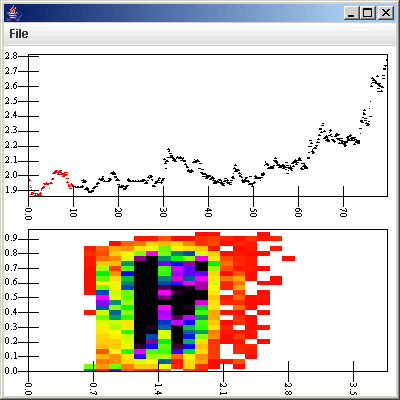
If we bring up the Control Frame for the Movie Filter again and press start, we will see the highlighted points move across the upper plot as the lower plot changes with the time evolution. So now you see how SWIFTVis can be used to display more than one type of data from teh same source and how branching in the graph can allow you to view the data in different ways at the same time. You have also seen how overplotting can be used to highlight subsets of a data set. The data sets are drawn in order going down the list, so lower ones will overplot the higher ones. If you create one out of order, use the Move Up button to reposition them.
There are some things to note about what was done here. In the first tutorial we plotted two different values in one plot area by splitting the plot area. Here we created two plot areas. The reason is that these plots don't really share a common axis. In the first tutorial, both the e and a data were plotted against time so they could share that axis and things worked well. Technically, we could have placed these two plots side-by-side by creating a second primary axis for time and either sharing the eccentricity axis, or by making a second eccentricity axis and using it on the second plot. This is a worthwhile exercise to see if you understand how to create and manipulate multiple axes. However, in this situation, because the two plots show very different types of information, we decided to go with two completely different plot areas. One downfall of what was done here is that the two selection filters that we created must both be set to pull data from the same particle for the upper plot to look correct. Failure to do this will result in the highlighted points not following the points in black. The idea still gets across, but it looks a bit funny. In a later tutorial we will explore another way that you can get similar functionality of looking at slices through data that doesn't use a movie, but instead allows you to click on one plot and have it change the selection either in that plot or another plot. Now we move to looking at using the SWIFT discard data as part of our analysis.