bin.dat Tutorial
The most commonly used data file when working with SWIFT is the bin.dat file. This file records the orbital elements of all of the particles in a simulation at regular time intervals. Previously, people would analyze these files either by writing their own programs, but by using the follow command to pull out a text version of one particle at a time from the full file. SWIFTVis was written in large part so that people would not have to look at there data in that way and so that they could quickly look at more information from the bin.dat file.
To do this, one start by adding a "Data Source " to the graph. This is done with Insert > Data Source or by pressing Ctrl-D. This brings up a dialog box that has a drop down list of all the source types that are in SWIFTVis. Others can be added to this. To learn how, see the page on configurability. Select the "Binary Position" dataset type to read in information from a bin.dat file. This will add a box to the graph the is labeled with Binary Position. You can click on this box to select it. Doing so will bring up the properties panel on the right side of the SWIFTVis window which is shown in the figure below.
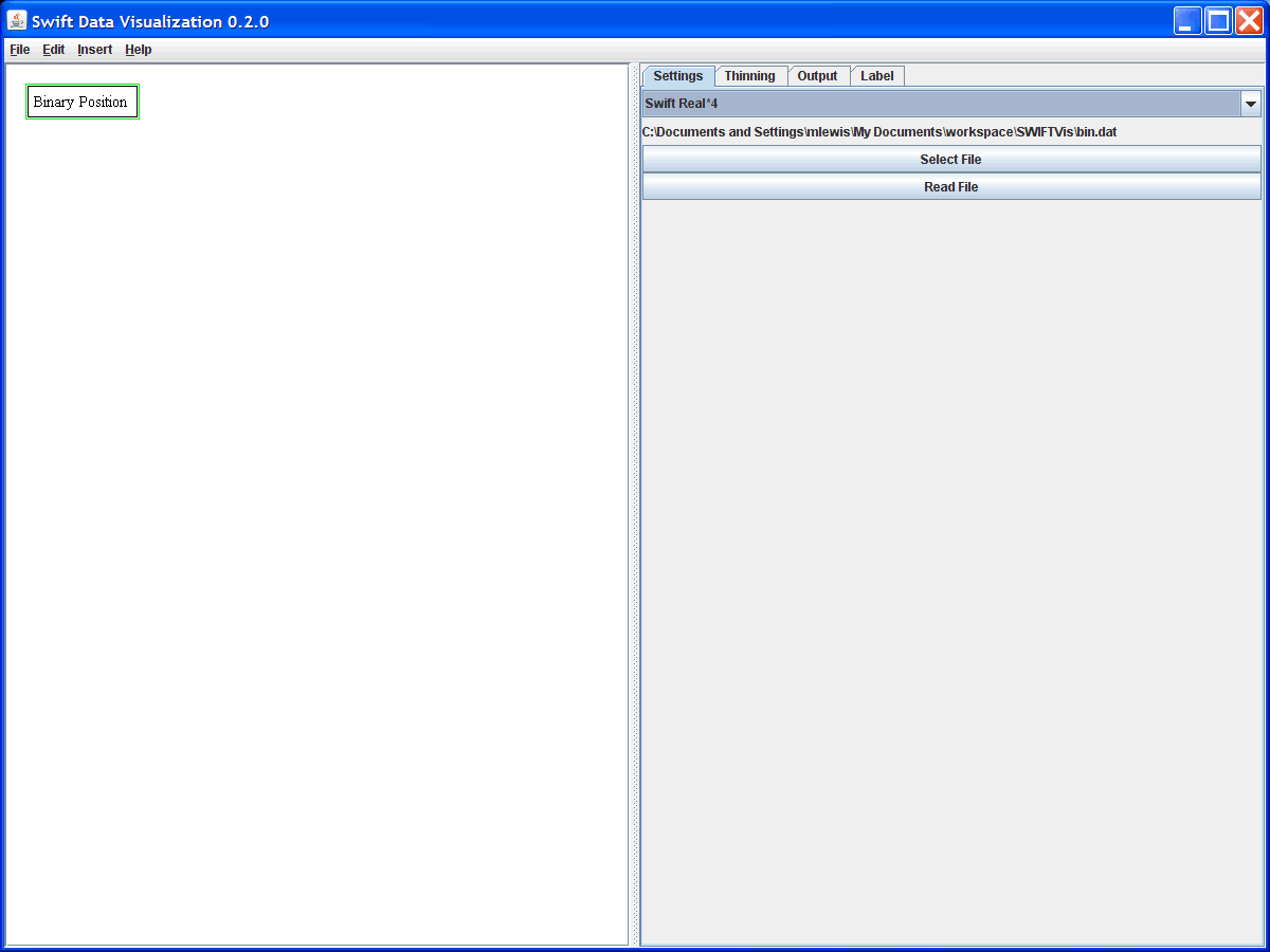
From this panel you can select the file that you want to read and initiate the process of reading the file as well as set the parameters for how the file should be read in. You can also specify thinning parameters. That is covered in more detail in the discard tutorial. The Label tab will allow you to change the text that appear in the graph on the left for this source. For small graphs this isn't generally required, but when the number of boxes and connections gets large it can help you keep track of what different things are doing. The Insert menu also has an option for putting in a note that appears as a box in the graph. It can't connect to any other elements, but you can change the text in it to act as documentation.
Once you have picked a file and read it in, you are ready to insert filters. You can insert a filter by going to the menu and doing Insert > Filter or by pressing Ctrl-F. Again you will be presented with a dialog box that lists the various filters that are available to you. We'll start with a selection filter. This is one of the simplest and most useful filters in SWIFTVis. The figure below shows the Binary Data source along with a selection filter. Notice that the selection filter at the top is selected. The right side of the window shows the options for it. If you add a filter while a source element or another filter is selected, the two are automatically connected so that the new filter takes input from the selected element. If nothing is selected when you add the filter, you will need to insert a connection to link them. To do this do Insert > Connection or Ctrl-N, then click the mouse on the source elements and drag it to the sink element. You should see a line between the two points. Release the mouse while you are on the sink element and a connection will be made. If you click or release in the wrong spot, you can simply insert another connection and try again.
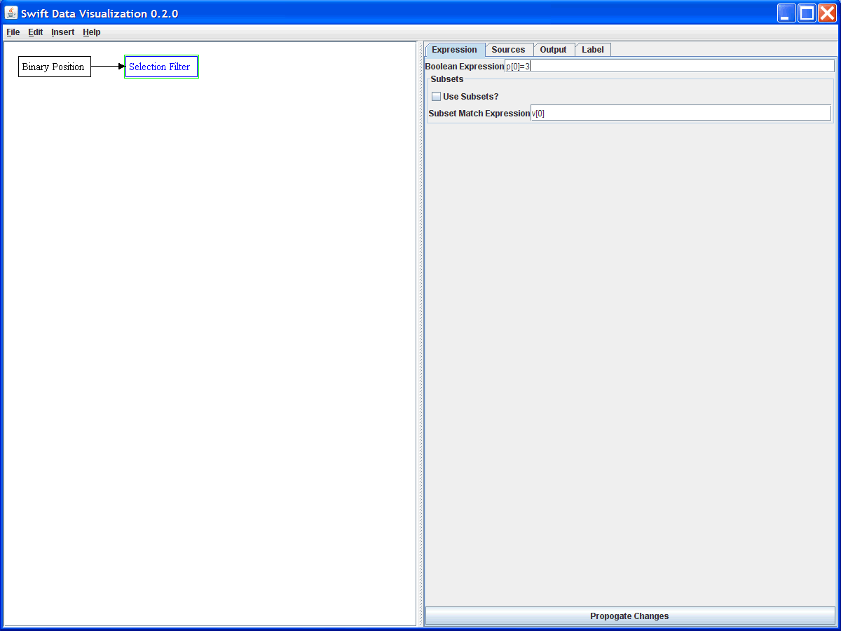
The options for the selection filter are fairly simple. Notice that there are 4 tabs at the top. This is standard for all filters. The Sources tab lets you look at what data is coming in from the various sources as well as the order of sources which can help for entering formulas. The Output tab lets you see what this filter will pass on to anything that it connects to and has buttons allowing you to save that information to a file that you could use with SWIFTVis or other tools later. The Label tab is the same as for the source described above. In the Expression tab, which is shown, you have the actual settings for the selection filter. This filter takes a BooleanFormula in the top text field. Normally, any element for which this expression evaluates to true will be in the output of this filter. Here we see the formula p[0]=3. p[0] is the first parameter for the input and from the bin.dat file, it is the particle index. So this filter is selecting only the data from the test particle numbered 3. We won't be using the subsets option for this particular example. It allows you to do things like select the full path of any particle that meets a certain criteria. When you are done making changes, click on the "Propogate Changes" button at the bottom so that the program will run through all the data and produce the proper output.
If we want to see what this data looks like, we can send it to a plot. We add a plot by doing Insert > Plot or Ctrl-P. Again, the plot is connected to a source if one is selected, otherwise you can draw in a connection. The plots have a very large number of options and you can look at the Plot page to see them all. For now we will focus on just what we need for this example. Selecting the plot element you will see something that looks similar to the figure below, but without the "Plot Area" under the "Plot Spec". To add this, click on the "Add Plot" button.
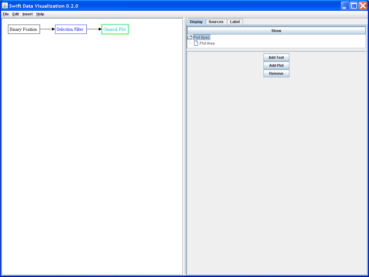
Once you have added in a plot area, you can select that area to see the more general options for a plot. That will give you a view like what is shown in the figure below. The plot area has a 7 panels of settings that you can adjust. For a simple plot like we want to produce first, most of the default values will work.
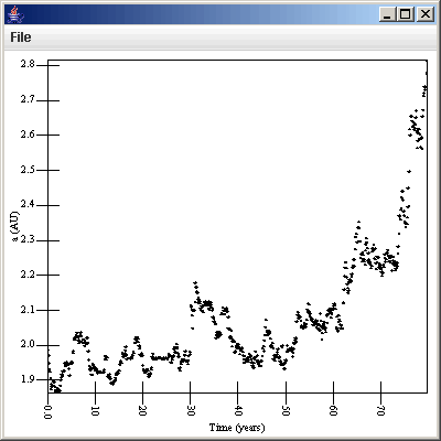
By default, you will get a scatter plot of a vs. time because of the meanings of the values coming from the Binary Position source. You can click show to see this plot without labels on the axes. To put labels on the axes, click the Primary Axis, then click on the one axis in the list at top, then change the value in the Text field. Click the "Show?" button to have your text show as an axis label for that axis. Repeat this process for the Secondary Axis tab. The figure below shows this plot for a particular data set.
To see the data for a different particle, simply click on the selection filter and change the formula then click Propogate Changes again. The data for the new particle will automatically appear in the plot.
Now say we want to look at a different set of values. Clicking on the "Data Sets" tab and on the Scatter Plot at the top of the list where we can do this. By default, the scatter plot uses v[0] for the x-axis value and v[1] for the y-axis value. These are time and semimajor axis in the bin.dat file. We could change the v[1] to v[2] and see how eccentricity varies with time instead. If you can't remember what index is what, that isn't a problem. Simply click on the Sources tab and look at the source coming it. The column headers tell you what values are what. Remember to click the "Apply Changes" button at the bottom of the panel after changing the formula so that the plot will be updated.
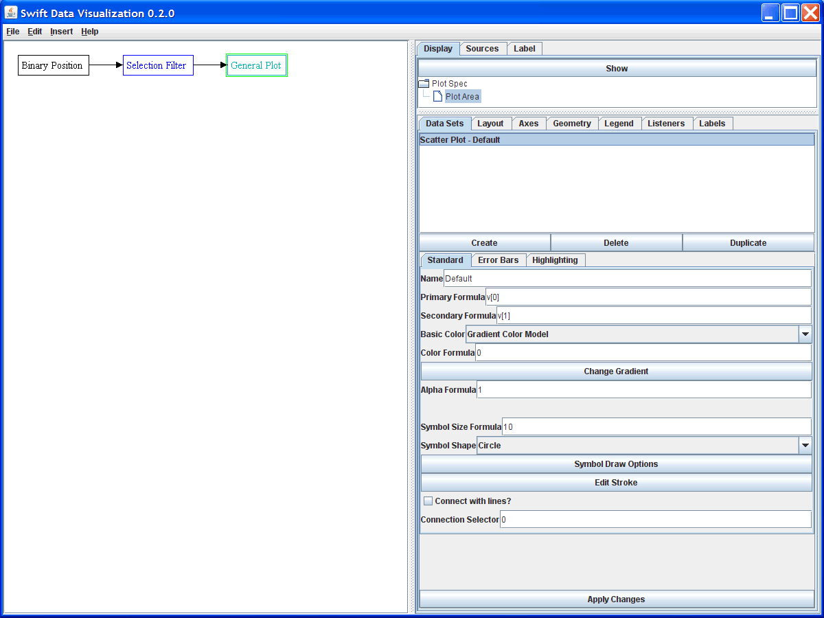
At this point we will do something a bit more complex. Suppose that you want to see how both semimajor axis and eccentricity vary over time. We will do this first by overplotting the two, then we will put them in two separate plots stacked on top of one another. Before we make a new data set to plot, let's change the original one back to v[0] vs. v[1] and edit the name to be "a" or "Semimajor Axis". This will help to keep things straight. To display two data sets at once we need to click the "Create" button under the "Data Sets" tab. This brings up a dialog box much like those for data sources and filters. We want to make a new Scatter Plot. By clicking on this scatter plot, we can see the options for it. This is shown in the figure below.
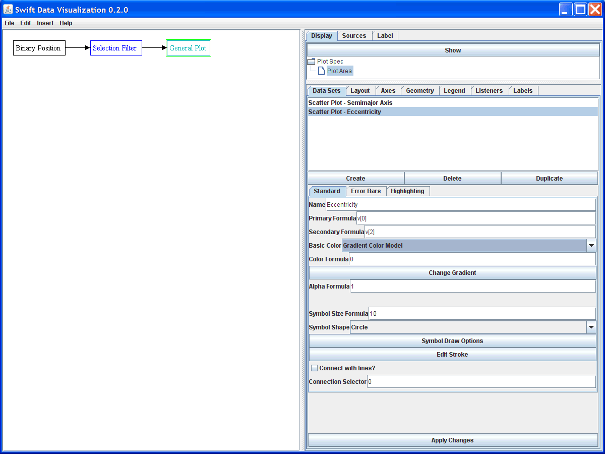
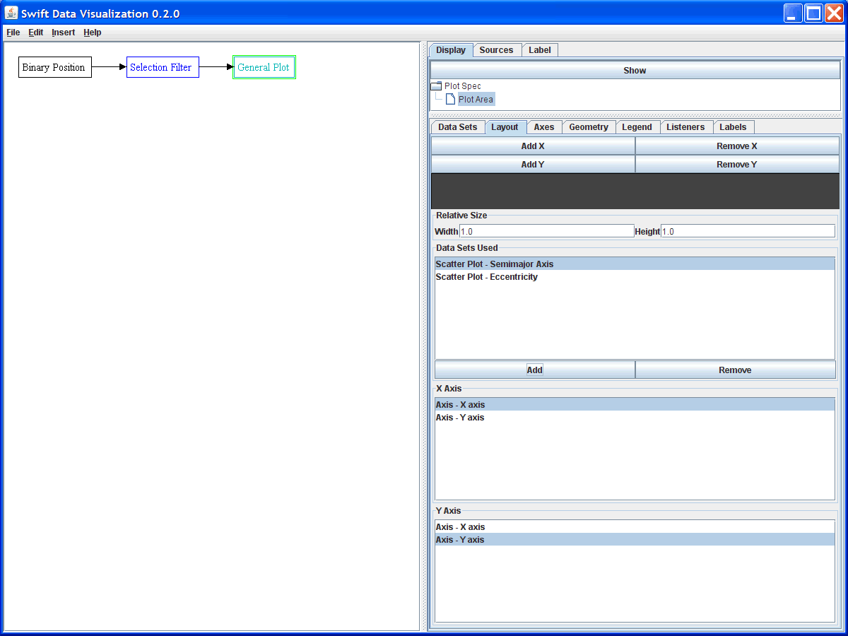
In this figure we have already entered a new name and changed the secondary formula to be v[2] for the eccentricity. You might also click the "Change Gradient " button and pick something other than black for this data set, or use a shape other than an oval. For the gradient, by default the color value is 0 which is also the bottom end of the gradient by default. If you look at the plot at this point you will find that it hasn't changed. In order for our new data set to appear in the plot, we need to go to the Layout tab and tell it to put both data sets on the plot. This is shown in the figure below. To get this we clicked the Add button and selected the second scatter plot to add in.
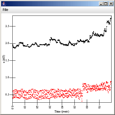
Now we have a single plot that has both a and e plotted as functions or time as shown in this figure. As you can see, we picked to do the eccentricity in red. While this does give us the information that we want, it isn't completely satisfying. The main problem is that it is plotting both a and e on the same axis. For this dataset that isn't too bad because they are fairly close to one another, but in general it isn't ideal. Plus, the one axis says "a (AU)" on it, which definitely doesn't work. To solve this, we need to create a second axis to plot the eccentricity on.
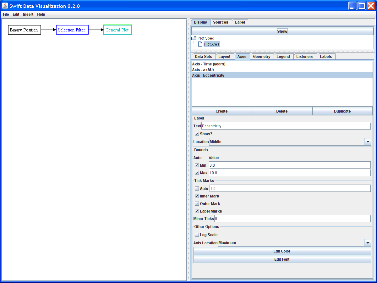
To create an axis, we go to the Axes tab and click the create button. This gives as a new axis that we can select. We can also change the label on this axis. For now it would also be nice to change the "Axis Location" at the bottom of the panel to "Maximum". This is all shown in the figure below.
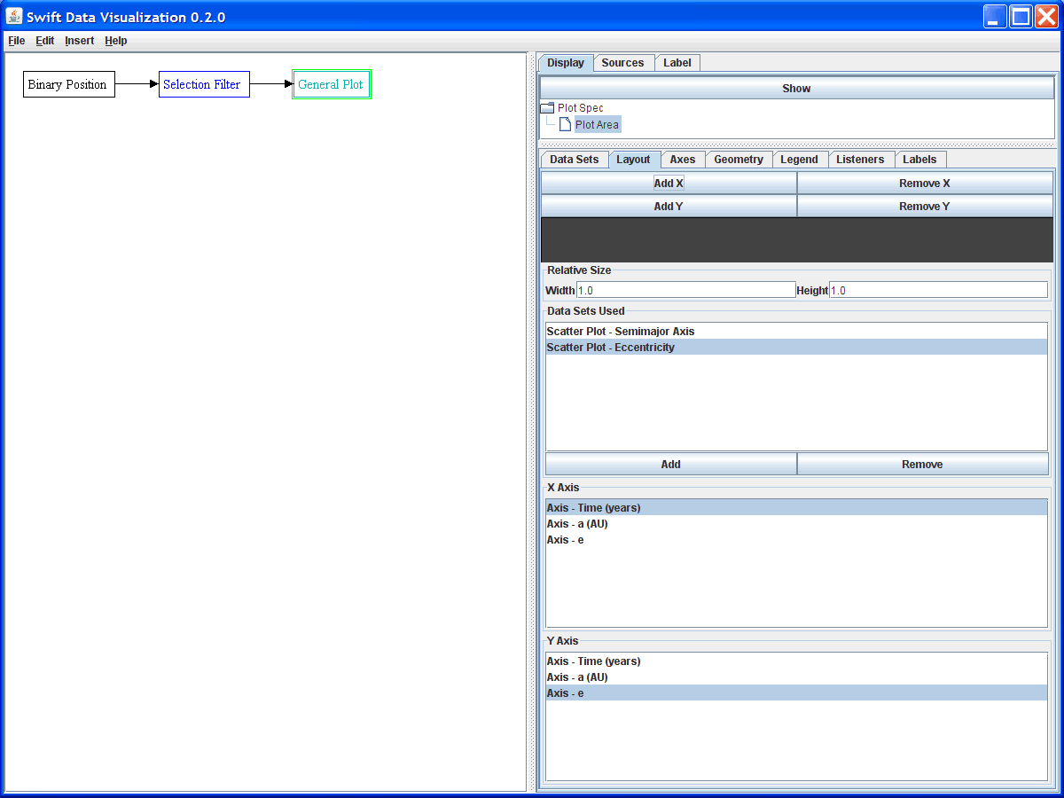
Now we need to go back to the layout and tell it to use this axis. Click on the Layout tab and select the Eccentricity data set. Now click on the new axis we just created for the y-axis of that data set. The figure below shows the Layout panel with the second data set added and the new axis selected. You will only see the axis selections for the data set that is currently highlighted.
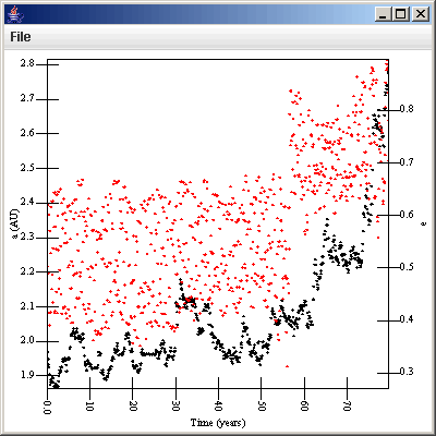
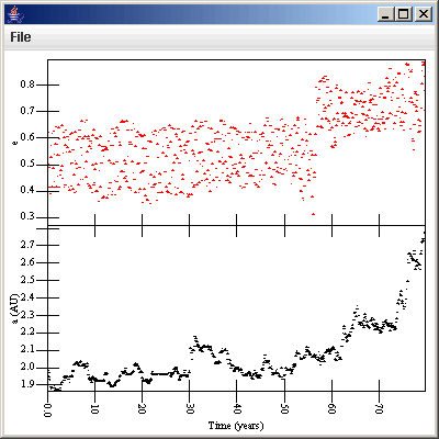
This produces a plot that looks like what is shown below. Notice that the eccentricity axis has been placed on the right side while the semimajor axis axis is on the left side. Some might find this overplotting a bit difficult to look at still. In that case, we can split it into two separate plot regions stacked vertically on top of one another.
The Layout tab has options at the top to make multiple divisions for each axis. In this case we want to take add a y-axis. This produces several changes. You notice that the gray region right below the Secondary Axis Count option has now split into two pieces, one colored dark gray and the other light gray. This region is actually a minature of the plot region that allows you to select which one of the plot regions you want to change settings on. The lower one will start off selected as in the figure below. Clicking Add Y will always add a new row above the one that is currently selected.
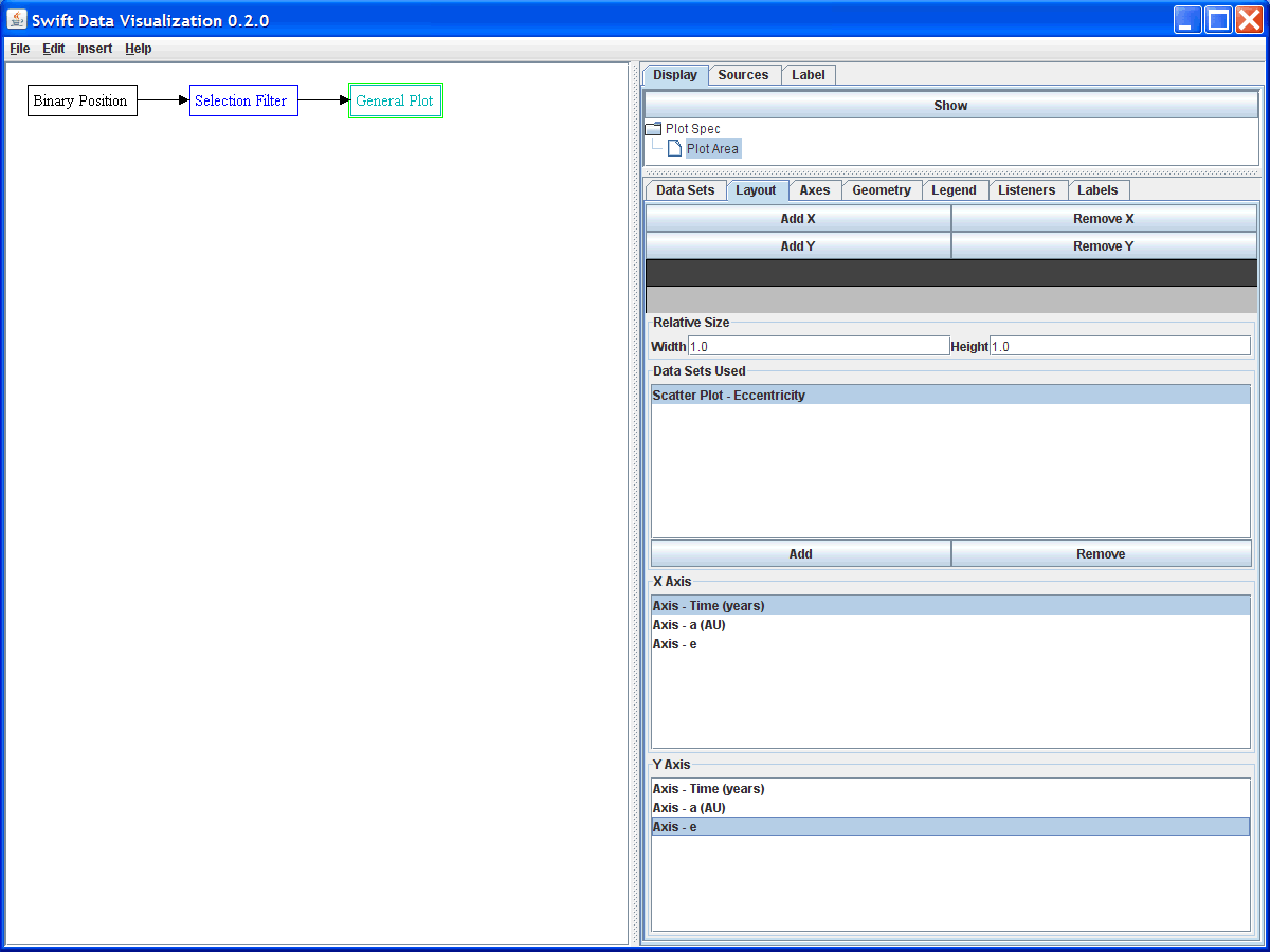
The cells in the new row all begin with no data sets being drawn in them. We need to remove the Eccentricity data set from the lower plot area and add it to the upper one, then select the e axis for it. To make things look nicer, you can go over to the Axis tab and change the e axis to display back on the minimum side. Once you have done that, you should have a plot that looks like this.
Obviously you can pick the format that you like the best, but the real advantage is how quickly you can see different information for different particles by altering the filter parameters. As a test of this, go back to the selection filter and change the formula to be "p[0]=3 or p[0]=5". When you click on "Propogate Changes" you will now see two particles in your plot. To select a larger range of particles you might instead use the formula "p[0]>=3 and p[0]<=7". This plot starts to get a bit more cluttered. Using the highlighting options of the scatter plot you could easily mark one or more of the particle data sets so they stand out. You can also use the line connection options to help you see what points are for the same particles. In this case you want the connection formula to be p[0] so lines will go between points from the same particle. We look at another way to filter the data from a bin.dat file in the next tutorial on binned data and surface plots. If you get your plot to a point where you want to save it off, there are two options. The File menu has an export option that you can use to save the plot as an image in either JPEG or PNG format. Note that PNG is lossless so ti might be the prefered option. There is also a print option. If you want to create a PostScript version of your plot, you can simply do a print with a PostScript printer and print to a file. Currently SwiftVis does no provide other options for saving off plots, but they could be added in the future. With free tools like ps2pdf and ps2epsi in the GhostScript tool set, most conversions to the format you want can be done with other tools.
See also full descriptions of: Binary Position Data Sources, Plots, and Scatter Plots.