Binning and Surface Plots
Another example of how you can use SWIFTVis to quickly view your SWIFT data in ways that might be tedious without it is the binning of data and viewing of surface plots of that data. As we will see, the binning can be done in multiple dimensions, you get to pick how many. This tutorial deals with plotting when binning has been done in 2 dimensions. For plotting data binned in one dimension see the tutorial on histograms and bar plots.
To run through an example of making a binned plot, we can start with what we had from the previous tutorial. All that really matters is the we load in a bin.dat file to use as our source of data. For this example, we will bin the entire data file so while the Binary Position element is selected, do Insert > Filter or Ctrl-F. Now we want to select the Binned Filter option. This will add a new element to the graph that you can position as you want. Clicking on this filter we can see the options for it. The figure below shows those options after all of the changes that we will be making have been made.
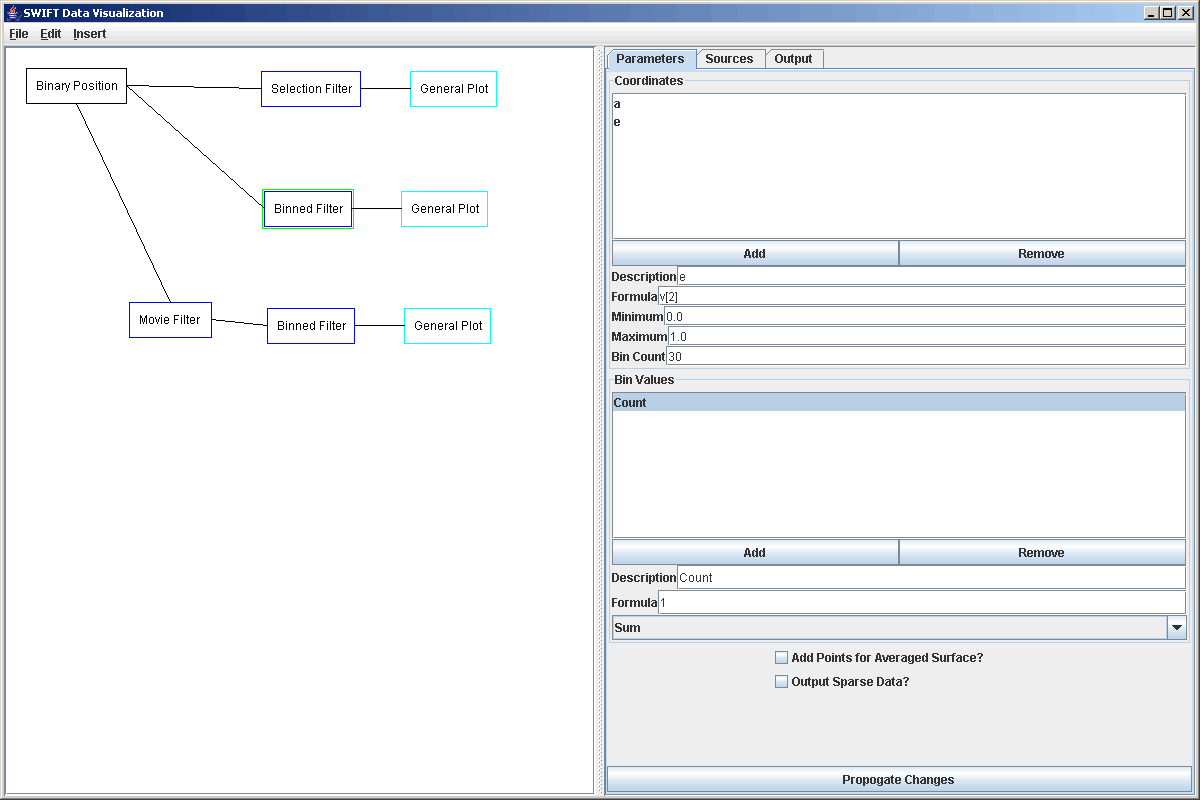
When you first go to the Binned Filter properties panel, there will only be one coordinate labeled x. We want to edit this coordinate first. We are going to bin the data to make an a vs e plot of this simulation. Select the coordinate and change the description to "a". The formula for this coordinate is v[1]. Again, if you don't remember what value indexes relate to what elements, simply go to the sources panel to see them. What range you want to bin the semimajor axis values over depends on the nature of your bin.dat file. For the file we used, the range of 0 to 4 worked nicely. We also went with 30 bins. We'll show the effects of changing that below. Now click the "Add" button in the Coordinate area to put in another binning axis. This one we want to label "e" and we have used the range of 0 to 1 with 30 bins as shown above. The rest of the options are fine. All we want to do here is add up how many particles fall into each bin. If we also wanted get average values of the inclinations of particles in each bin, we could add another Bin Value and change the formula to v[3], then set the method of combining them from sum to average. The first checkbox is for use with a different plot type than what we will use. The second one would be if we had data with a lot of zeros that we weren't going to plot and we didn't want all the zero elements going through to output to a file. Clicking Propogate Changes will do the binning and produce the output. You can go look at the Output tab to see the elements that will be passed on to the next element.
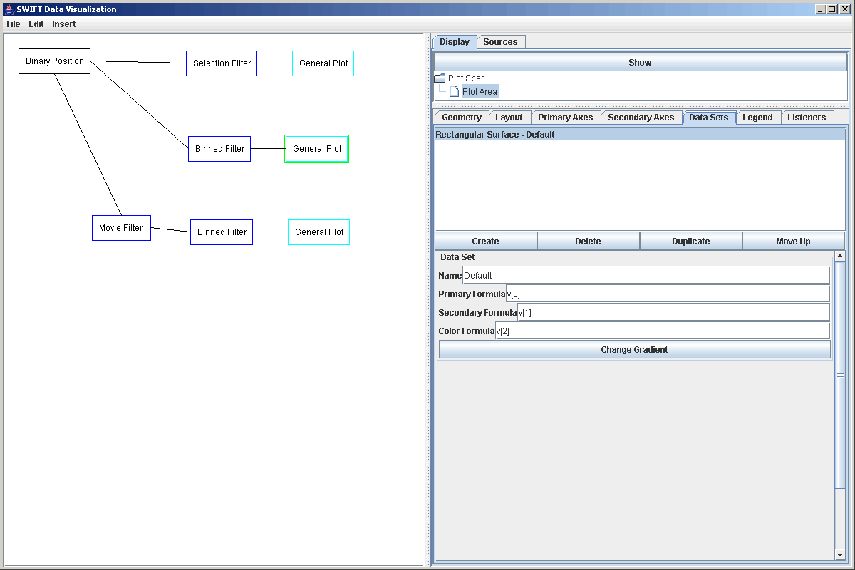
In this case, the next element will be the plot. Select Insert > Plot or Ctrl-P to add in a plot after the Binned Filter then select the plot and click the Add Plot button. In the plot panel click on the DataSets tab and we want to add a different data set. At this point you could click the Show button to see the plot, but by default it is a scatter plot so all you will see is a regular grid of points, not what we are interested in. Instead, we want to add a new data set. In the case, we want a Rectangular Surface. After you have added that, go ahead and select the Scatter Plot and remove it. Your plot properties panel should look like the figure below. Go to the Layout tab to add the Rectangular Surface plot into the main cell of the plot. If you don't do this, nothing will be drawn because the Scatter Plot was the only thing there by default and we just removed it.
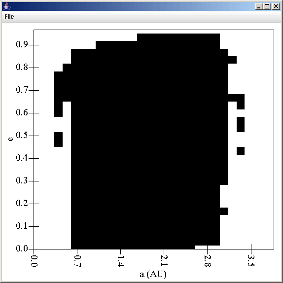
The default values for the different formulas are fine. If you show the plot though, you will see something that looks like what is shown below. It has white where there were no particles and black if the count was greater than 0.
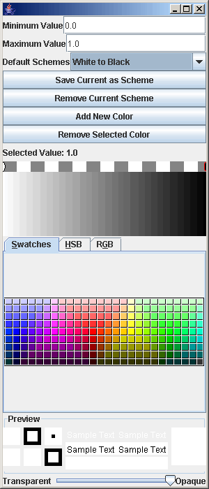
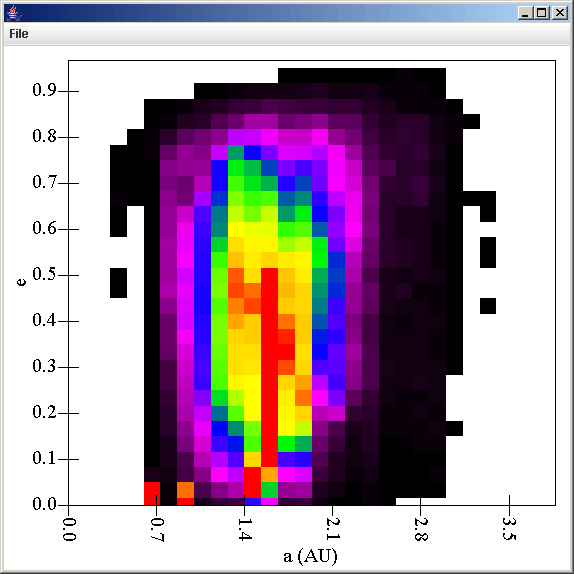
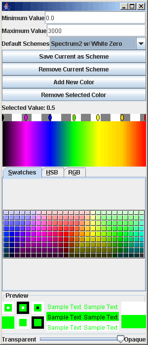
To fix this, we need to edit the gradient so click on the Change Gradient button. This brings up a panel as shown above next to the black and white plot. This panel has a number of different options on it. The first change that we have to make is to change the maximum value. The counts are integers and in our case, go up to a few thousand so we set the maximum to 3000. This changed the plot from black and white to a gray scale image. Using the drop box you can pick other pre-made gradients or you can use the bottom part of the panel to create you own. Creating your own involves adding colors in, changing their position, and changing their color. The gradient display in the middle allows you to select and move the color tabs (except the ones on the end) and to select color tabs to change with the selector just below it. You can also use the slider at the bottom to make certain colors transparent. This can be helpful for overplotting two or more data sets. In this case, we selectes Spectrum2. The plot and the gradient properties are shown below.
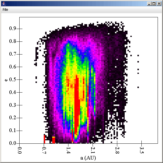
This plot is a bit grainy, but for some plots that is required because the number of counts is not that high. In this case we have counts up into the thousands so we can probably go to a higher resolution binning. To do this we click back on the Binned Filter and change the Bin Count value for both the a and e coordinates to 100. This lowers the count so we also go back to the plot and edit the gradient to use a maximum of 300 instead of 3000. This produces the plot shown below which shows significantly more detail without being too noisy.
Right now this plot technically includes both the planets and test particles as well as the time for the entire simulation. To cut out the planets, all we would have to do is put a selection filter between the Binary Position source and the Binned Filter. We could use a formula of p[0]>0 to select only test particles. Also, if we wanted to only look at the simulation after a certain time we could set the selection filter to only take time values above a certain level. These could be combined in a logic expression do to both by using the formula "p[0]>0 and v[0]>1000". This takes only test particles at times greater than 1000 years. Hopefully this has made it clear how easy it is to view your SWIFT simulations as binned surfaces and more importantly, how easy it is to quickly change parameters to inspect different features of your data. We'll see another use of inserting a filter before the binning filter to get a slightly different view of the data in the next tutorial.
We also have a full description of all of the options in a Binned Filter.